Up, Up and Away
PIONEER AGENCY KINGSTON NY SPRING 5.jpeg

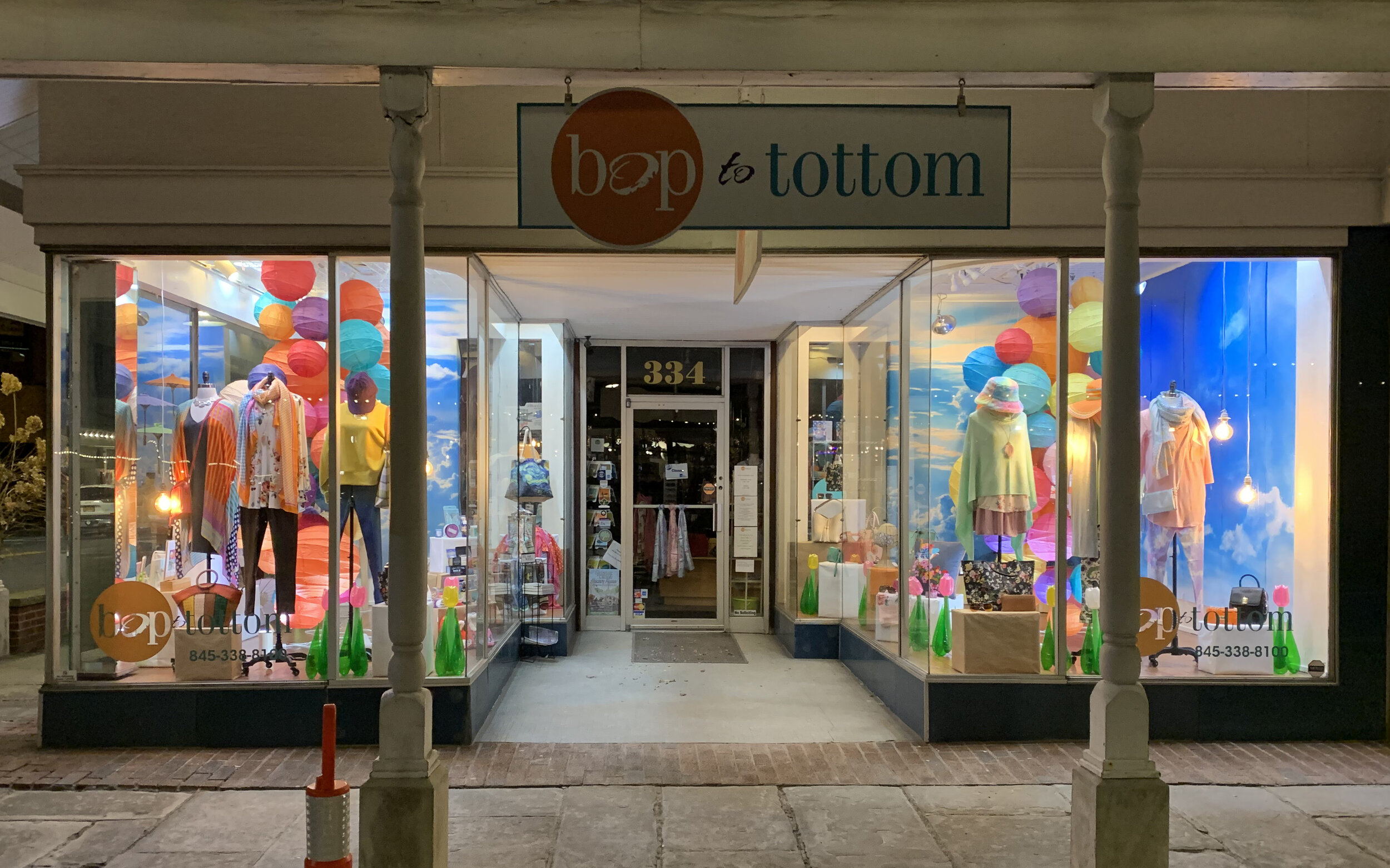
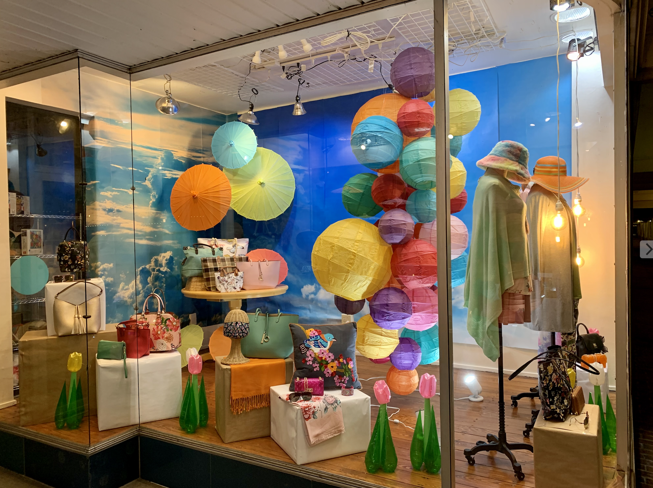
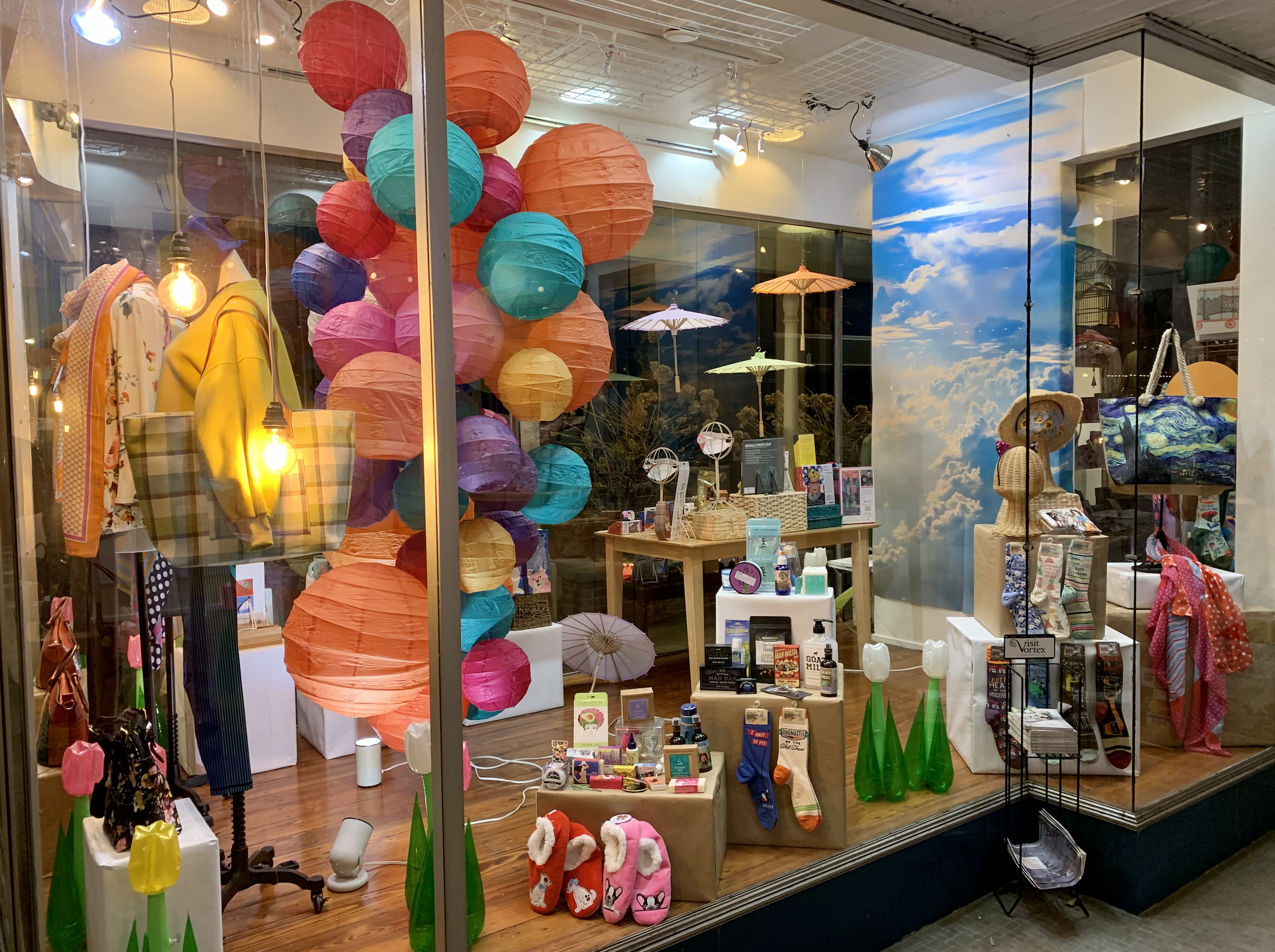
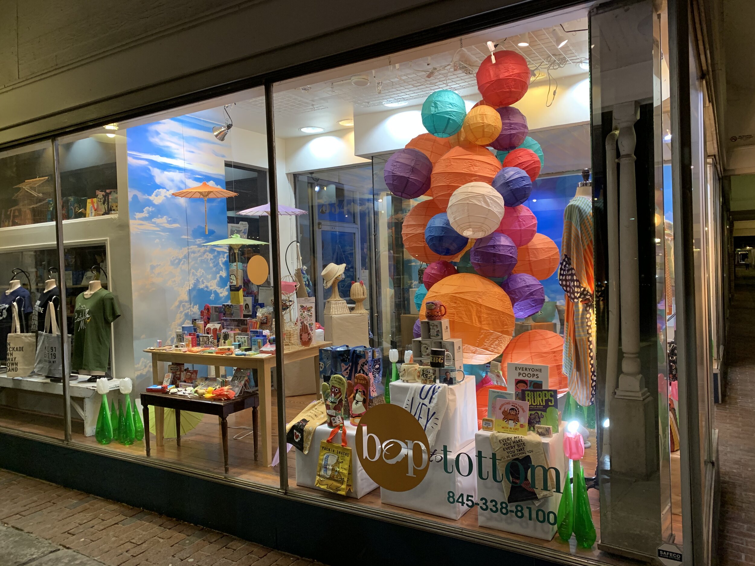
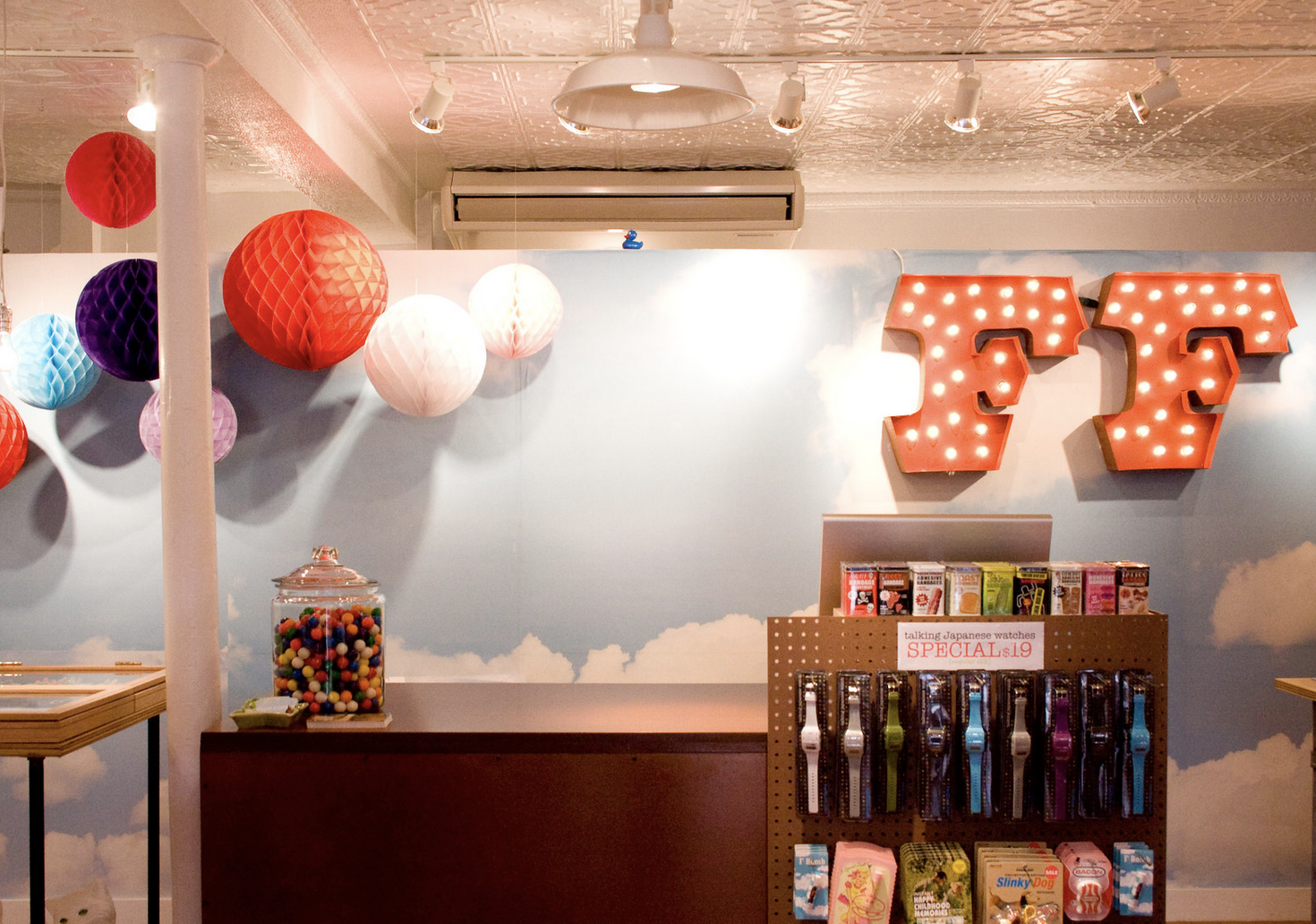
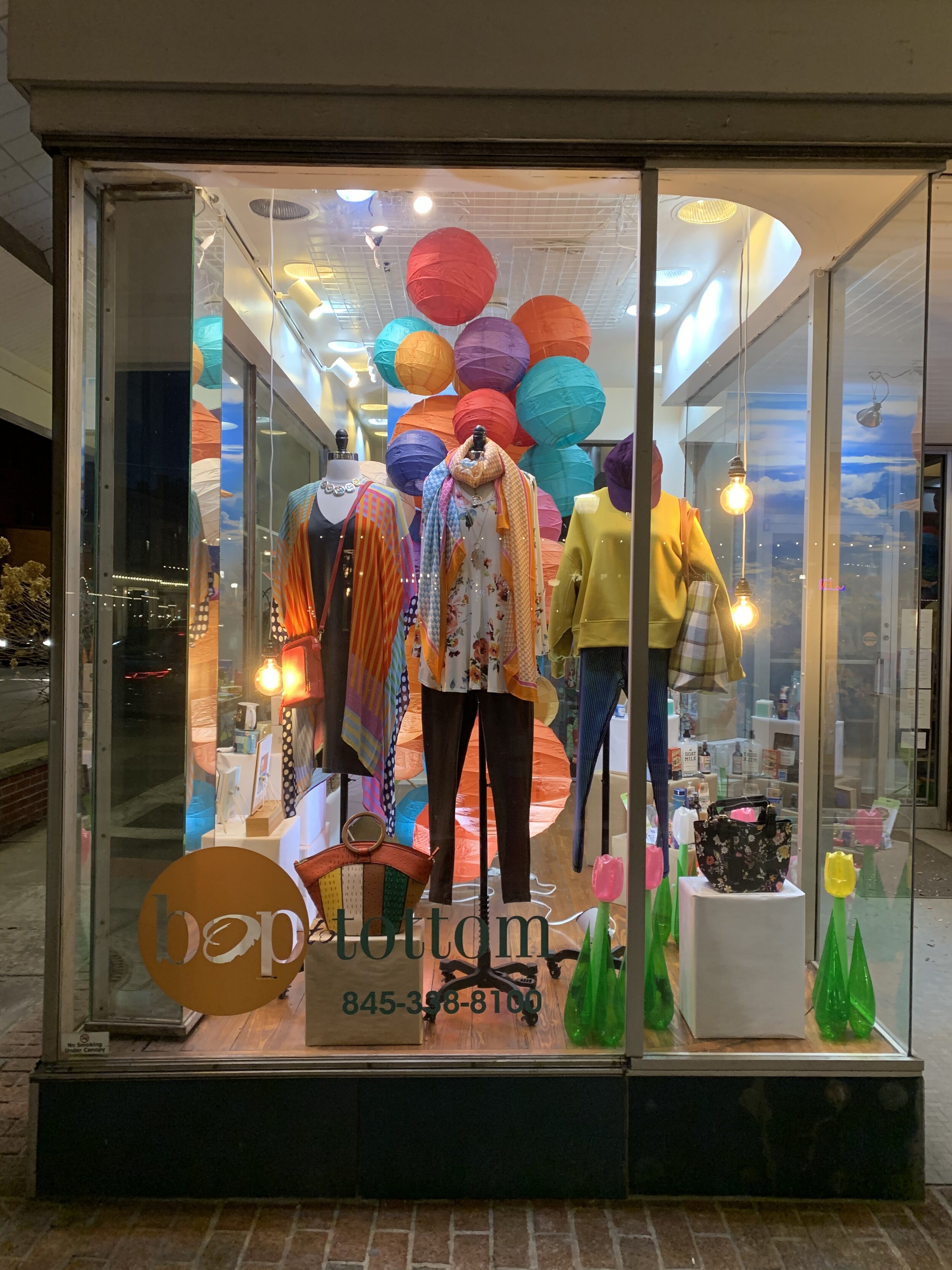
For my latest store window display I wanted to give the client (and the customers) something colorful and fun after a year of craziness and stress. It was also a priority to keep costs down.

I found some pictures hot air balloon launched, sky photo murals and tissue paper ball clusters that I thought were beautiful and used them as my inspiration. The owner had paper lanterns so the only prop we had to buy were the sky photo murals.

Even with my full knee replacement only 2 months old… Check out the wonder that was created.

My ispirado…

Neighborhoodie
IMG_0586.jpeg

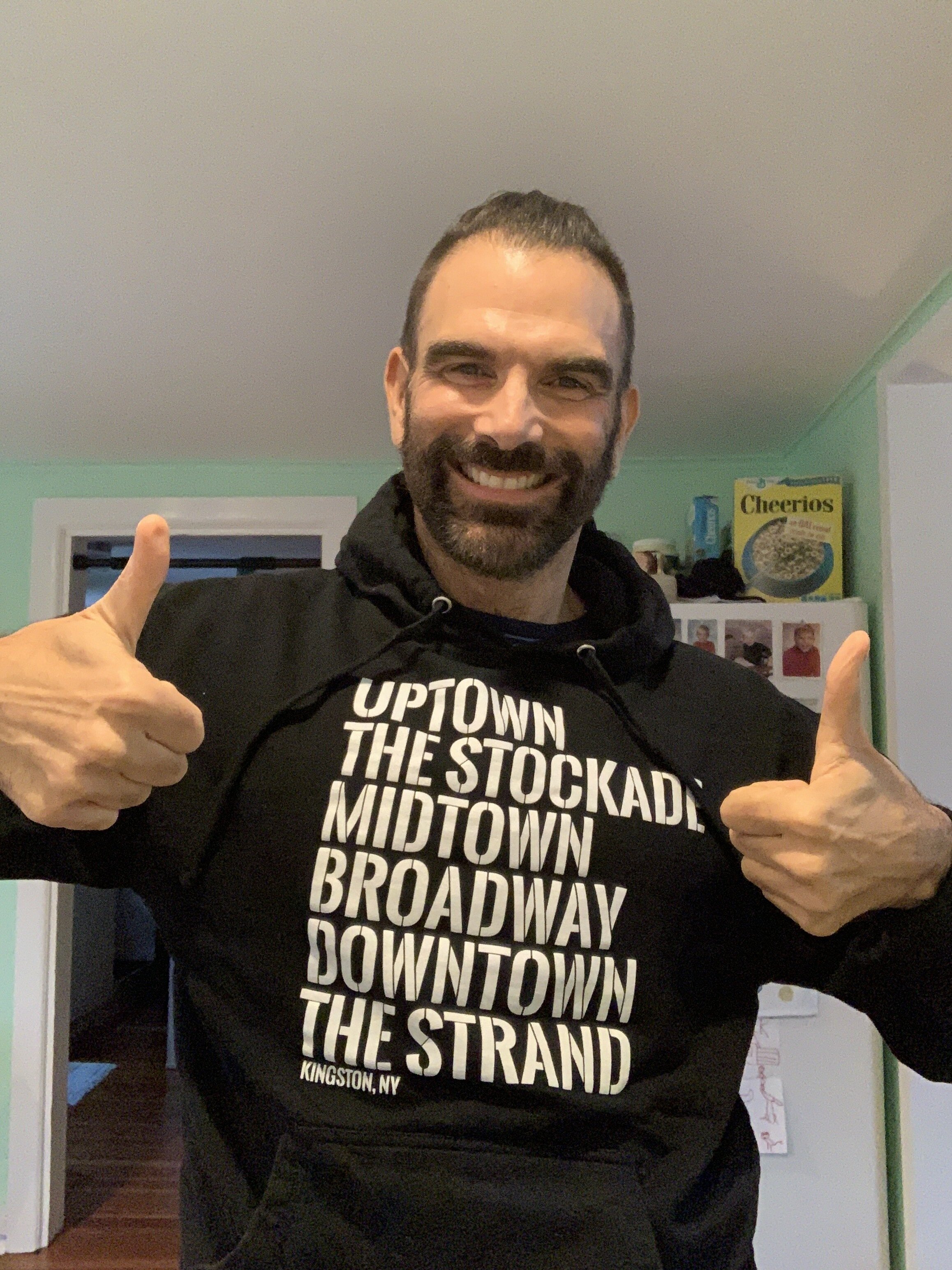
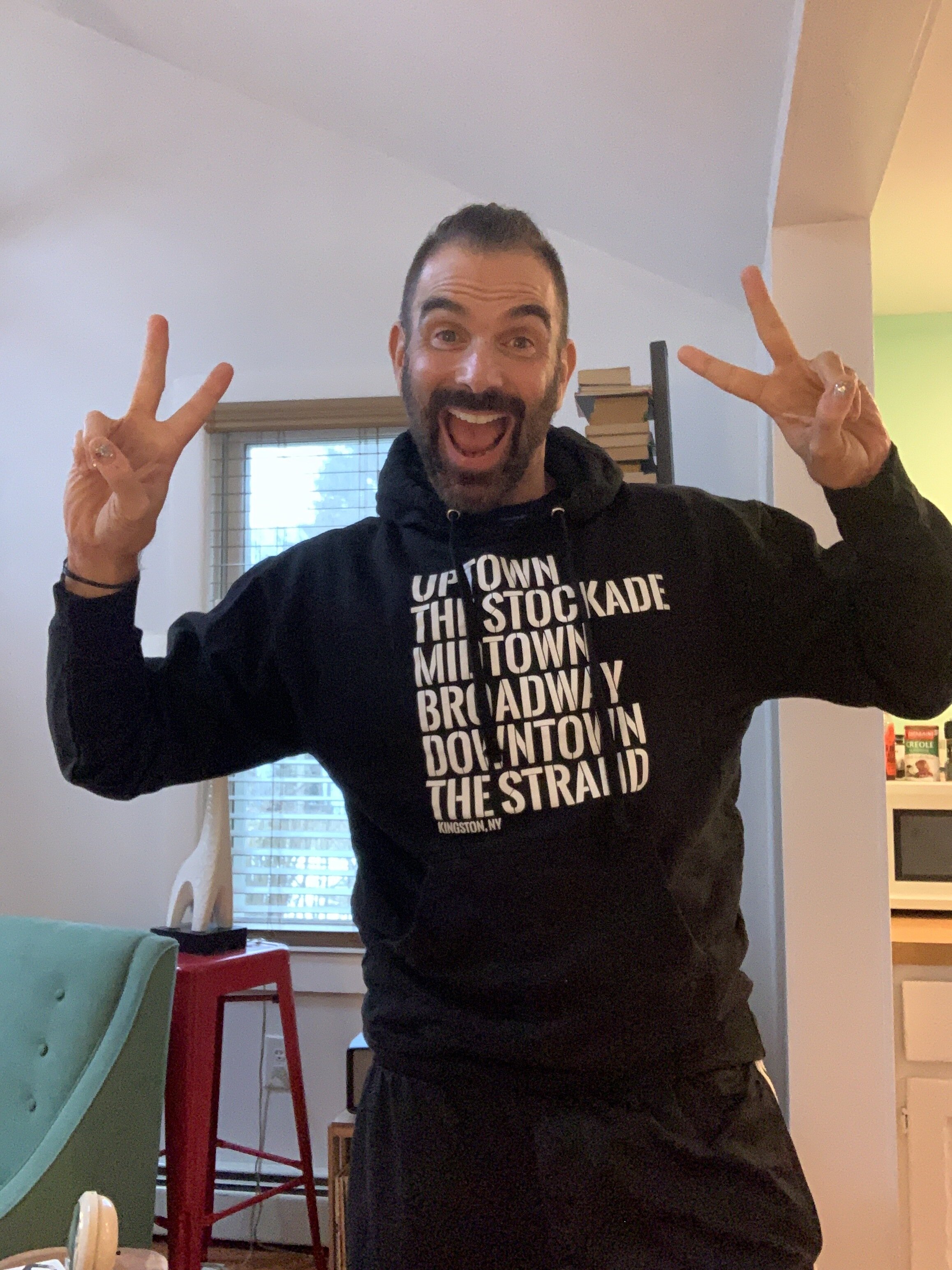
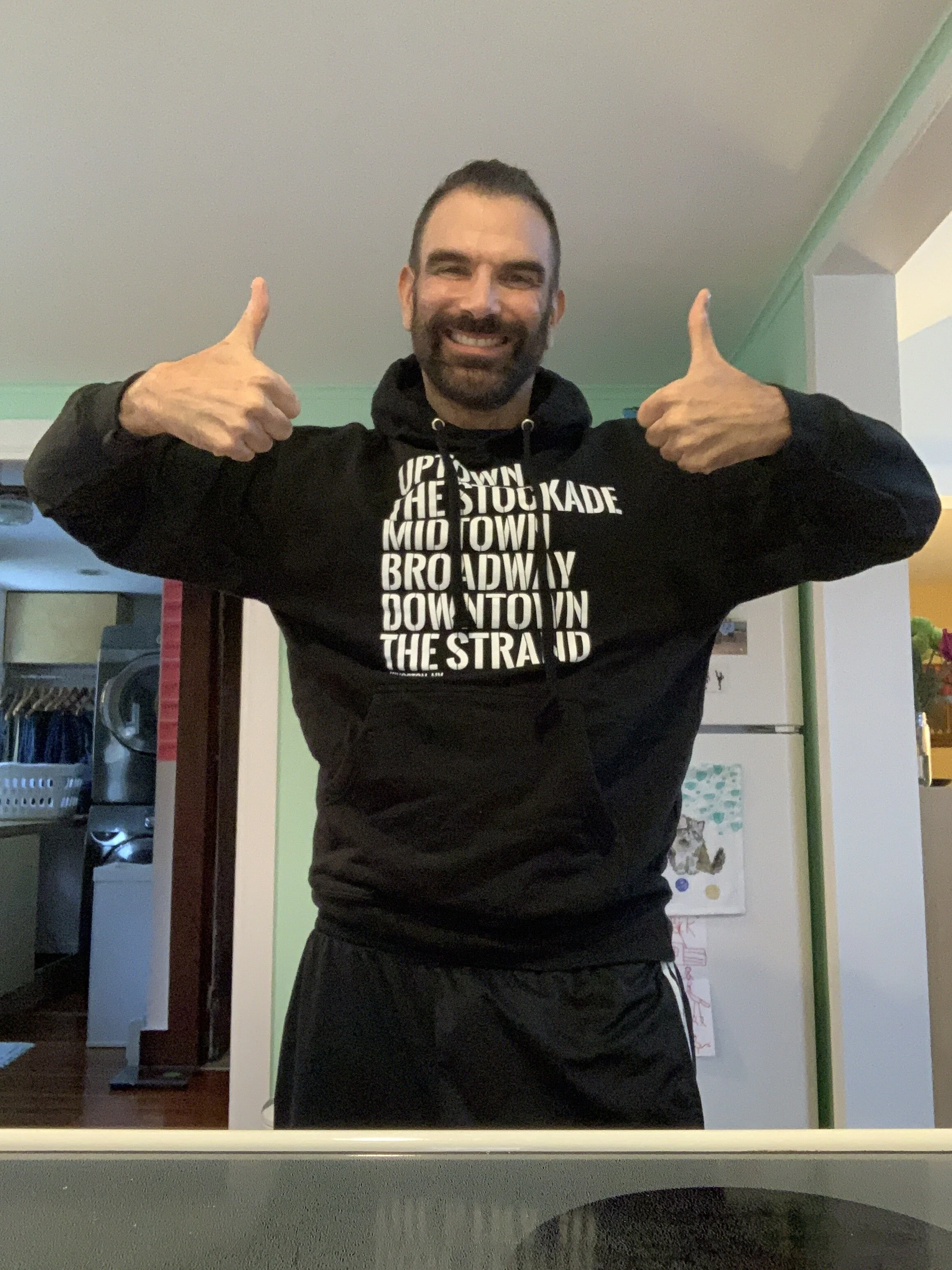
Check out this fun new design I did for Bop to Tottom in Kingston NY.

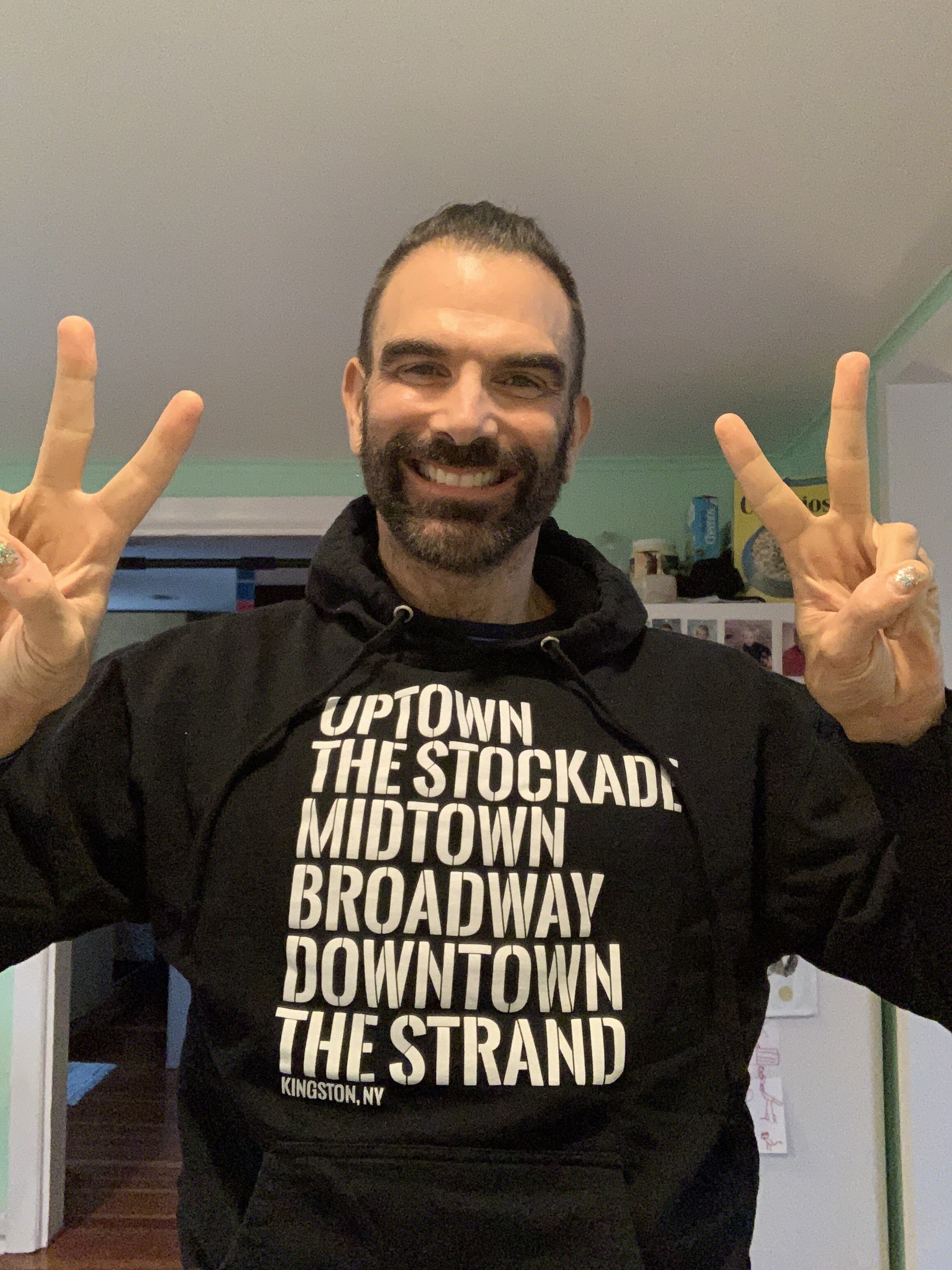
Kingston Neighborhoodie: Whether you’re an Uptown girl, a Downtown Dude or stuck in the Middle, chances are your fave Kingston neighborhood is represented in this new hoodie. Inspired by the NYC tee, this Bop to Tottom exclusive design showcases Uptown, The Stockade, Midtown, Broadway, Downtown and The Strand. Featuring our very own take on the West Side Story font, except in Kingston the Sharks and Jets are united. Printed in the Kingston, NY area. 100% cotton, black hoodie in unisex sizes SM-XL with front kangaroo pocket.

And you can even buy it online. But only if you live in the area as they’re only offering store pick-up at the moment.

Introducing Boptotottom.com
boptotottom.com blog copy.jpg

I first met Karen from Bop to Tottom back in 2015 to talk about an e-commerce website for her Kingston NY shop. It wasn’t the right time but when the Covid 19 pandemic hit in early 2020 Karen decided it was time to take the plunge and make her beloved Bop to Tottom boutique an online / e-commerce destination.

I chose to pitch the Shopify e-commerce platform. I love their responsive product and their customer service is excellent. I was able to foster a good deal for a year account so we forged ahead.

My goal was deliver a neat and polished site. Classy, professional and easy to navigate but also ring true to her brand. I accomplished this with a fun and engaging homepage. You can learn about the 20 yr old shop but also add items to cart right away (why wait). A clear and focused About page with lots of photos is very important to me. Also a useful and well written FAQ page and Policy and Procedure pages are a must in my book.

Give it a spin and let me know that you think. boptotottom.com

Piece by Peace
half+moon+books+kingston+ny+pioneer+chris+bick.jpg

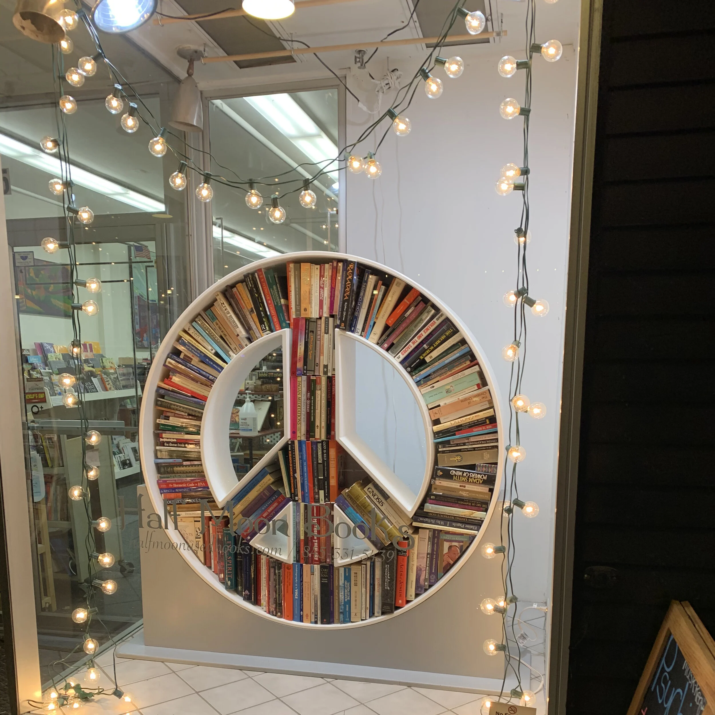
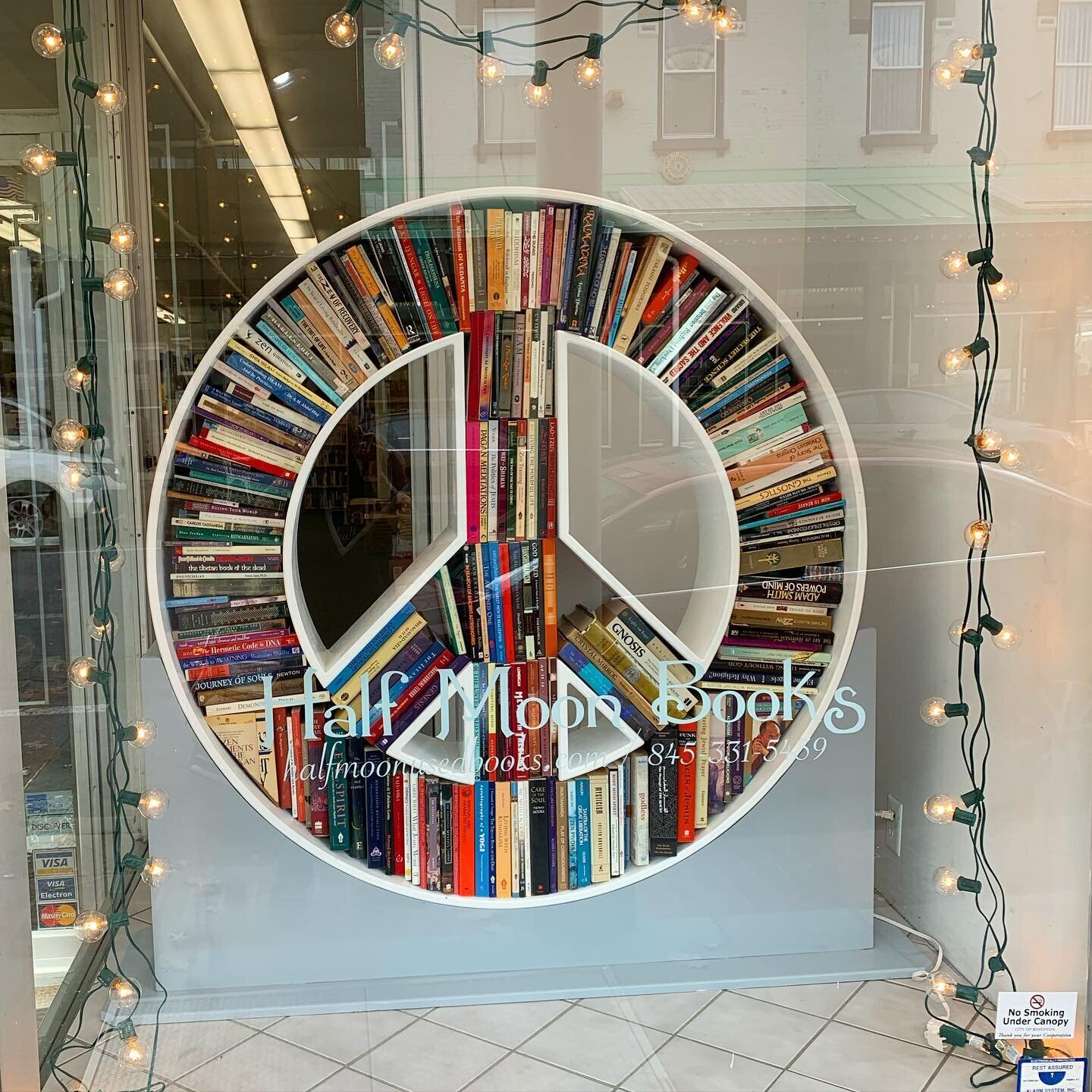
Ever since the huge success of the Circle of Books I did a few years ago, I wanted to play with books in a shape again and Jessica is always talking about the Peace symbol (we are in the Woodstock area after all)…

There was no better time than 2020 for PEACE. ☮️📚🎄

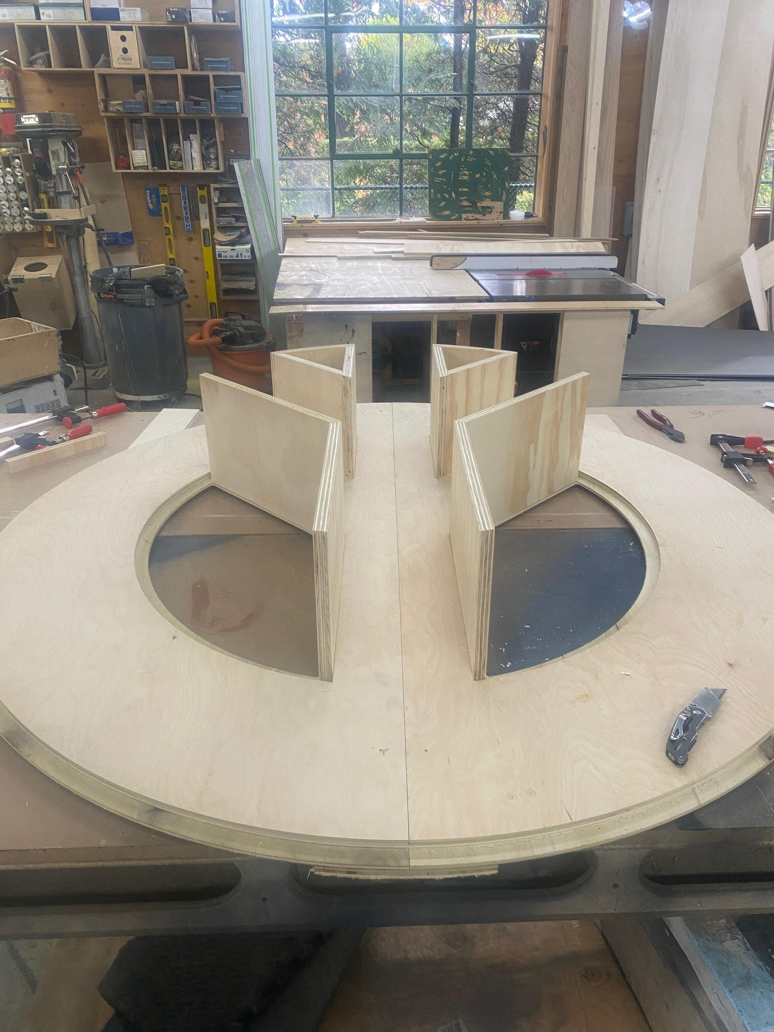
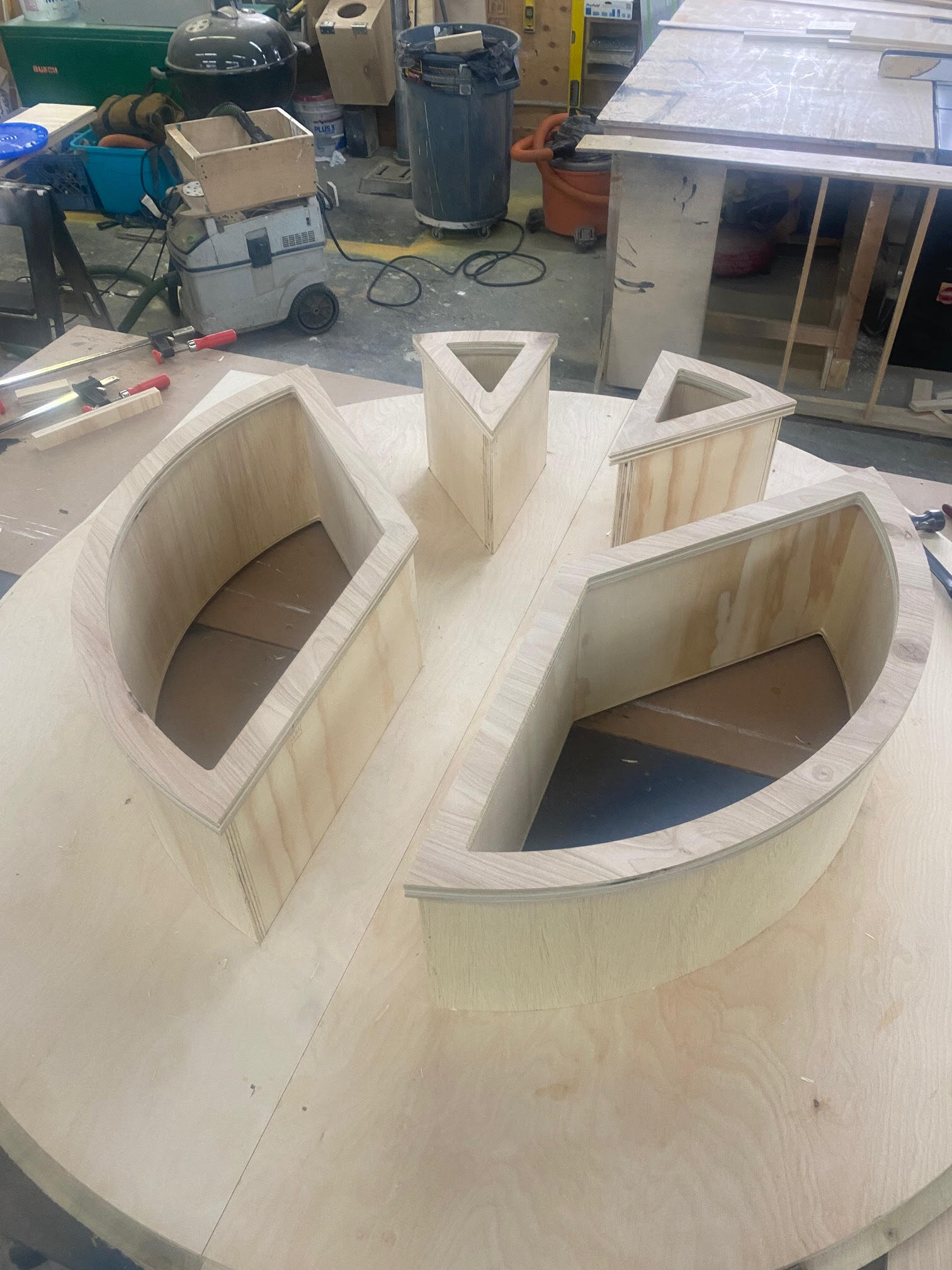
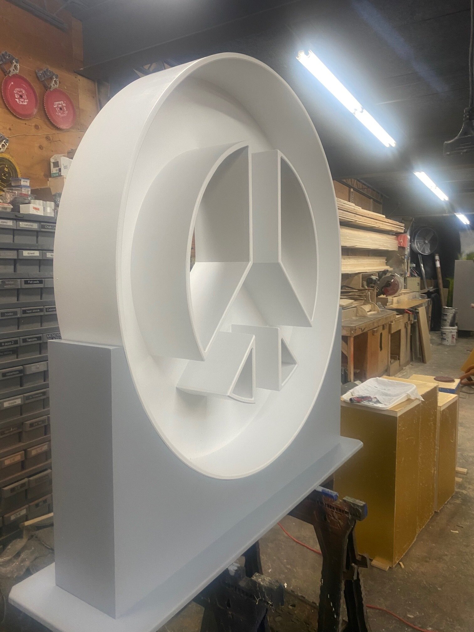
I pretty much had my heart set on giving Jessica a Peace-Shaped bookshelf for this Holiday Season. And thanks to ABunch Fabrication, it came true.

Here’s how it all happened…


My Design Inspiration:


My Amazing Sketch: Don’t laugh too much…

 
IMG_7219.jpeg


Design Development with ABunch Fabrication:


The Construction Process:


Installation:


The Unveiling:

Peace Out!

Peace Out!

White Heat
127565678_10158870457483607_8889183357462547566_o.jpg

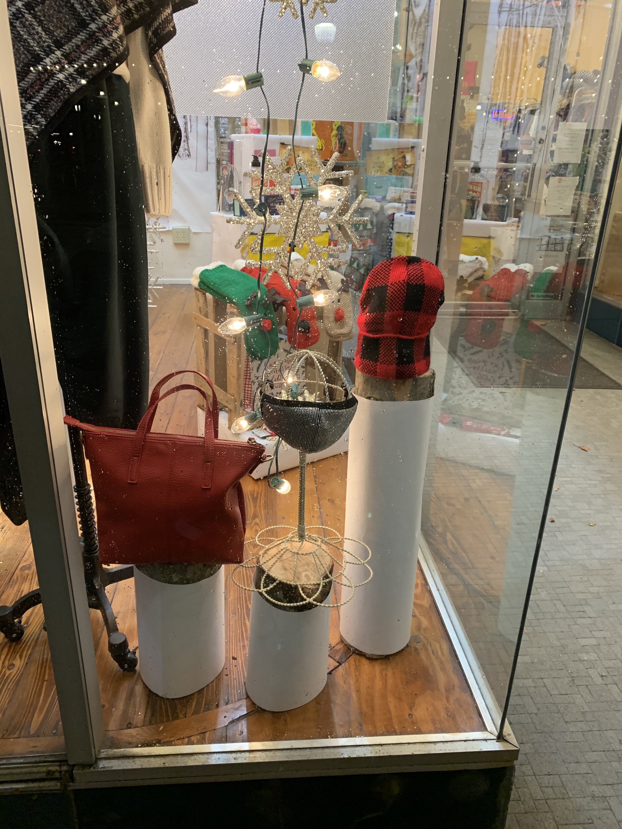
Another new Holiday Store window display complete… This one for Kingston’s very own Bop to Tottom.

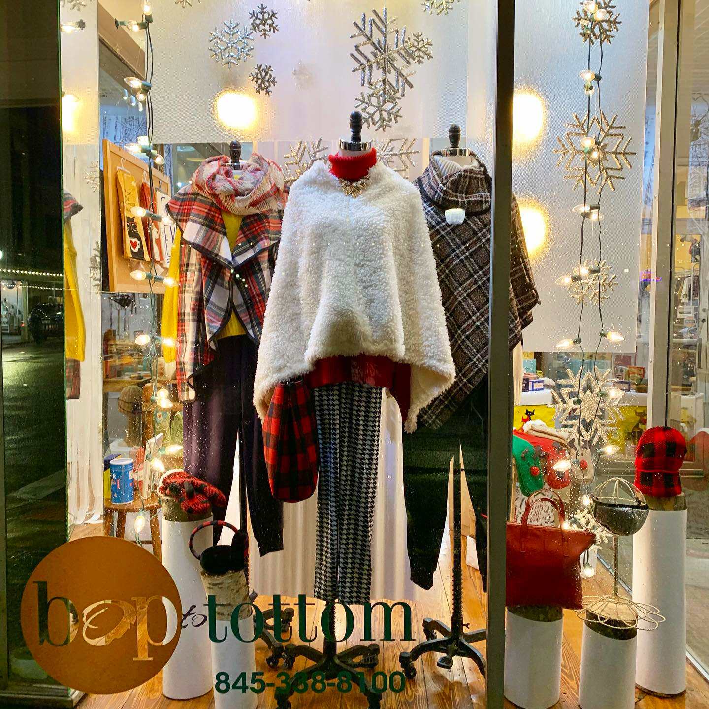
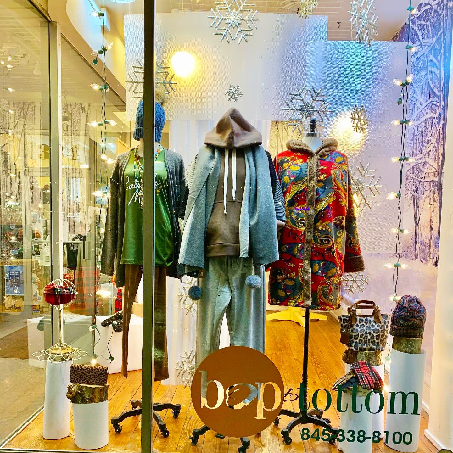
The client mentioned doing a window in all white (a fresh, calm feeling for this Covid Christmas), so I ran with that motif. But as usual, I wanted to use unconventional materials and play with light. I used florescence light fixture diffusers to distort the hanging light bulbs… Like a frosty window. I also used white corrugated roofing material for a “ski slope” backdrop for the dress forms.

Now, add some snowflakes, white wrapped boxes, Christmas lights and white ribbons and you’ve got yourself a wintry scene. I also wrapped the logs from last year’s display in white paper… Created such a cool effect and a lot quicker than painting them all.

Chalk it up
IMG_6956.jpeg

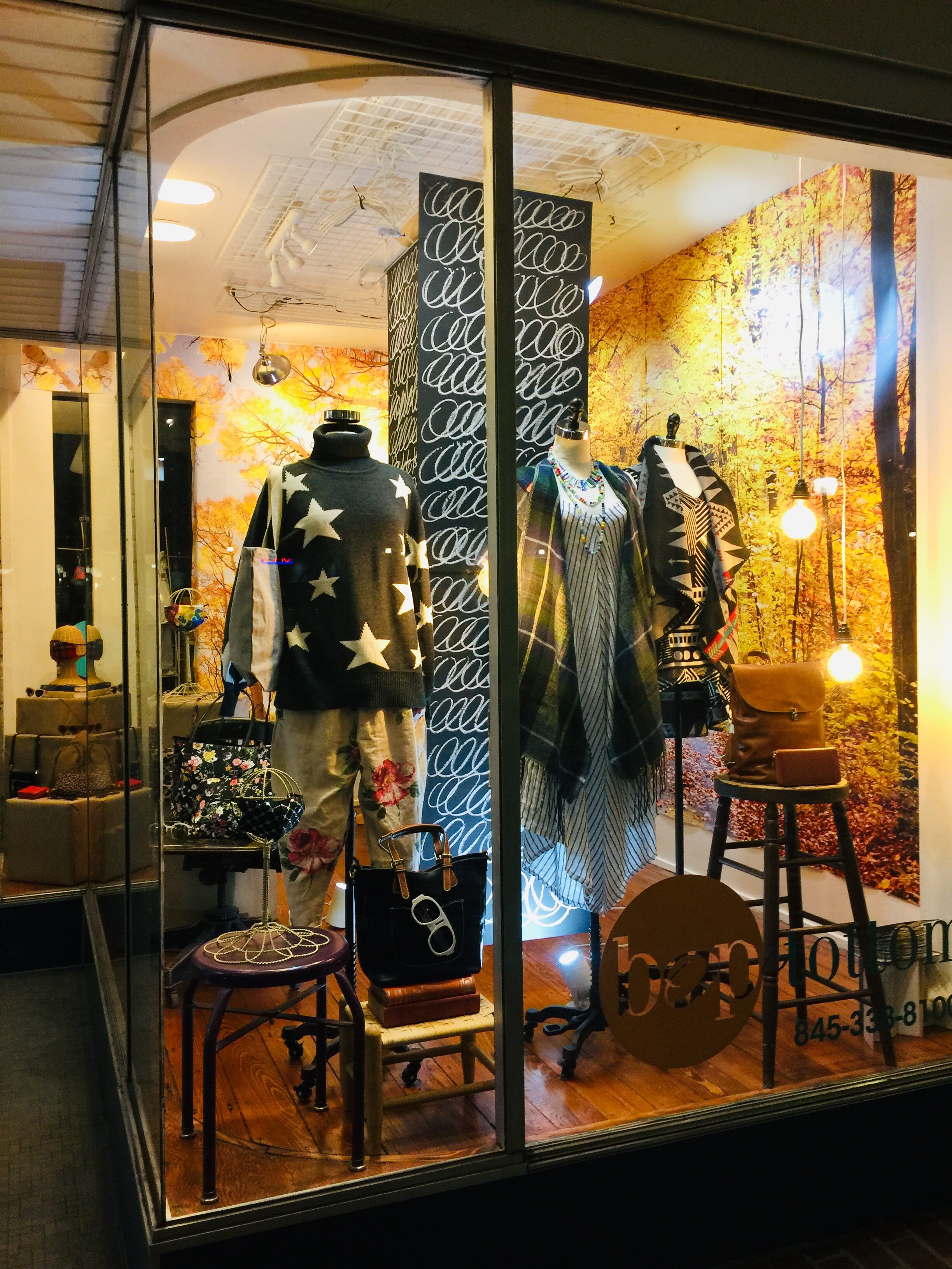
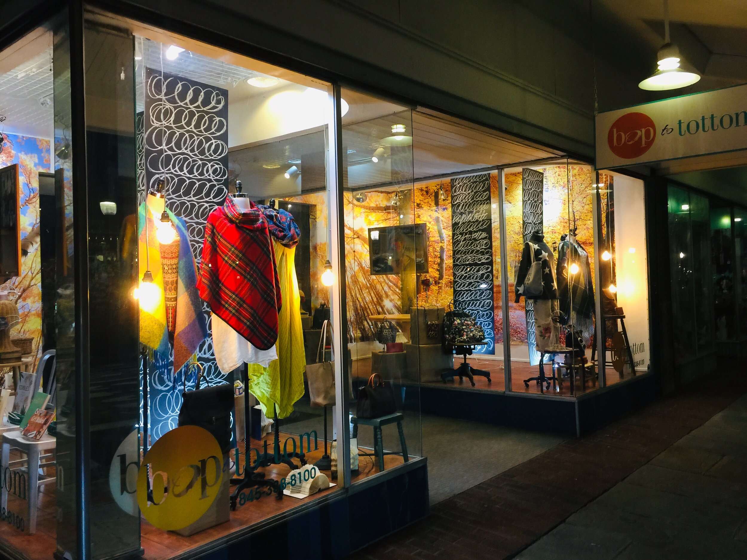
Check out the new Fall window display I just completed at Bop to Tottom in Kingston’s Historic Uptown Stockade District.

My design was to create a retro-class room vibe… Since many students would be learning online and missing the IRL experience. The client wanted to save some money on this display so I figured out some inexpensive alternatives for this window update.

Inspired by the artist Cy Twombly and chalk scribbles, I created these simple chalkboard vertical banners of 1/4” lauan wood and chalkboard paint with fun chalk scribbles. Since face masks are now top sellers, I printed photos of the owner and staff at a large size and hung them on old cork boards that were in the basement of the store - added bonus for the classroom vibe. Then I used photo murals on the back and side walls for that high impact fall colors background.

Initially, I wanted to get vintage school desks and chairs as props but they were to expensive so I just used some furniture I had lying around. And voila… Instant store window display on a dime.

Say Watt?!?
book chandelier.jpeg

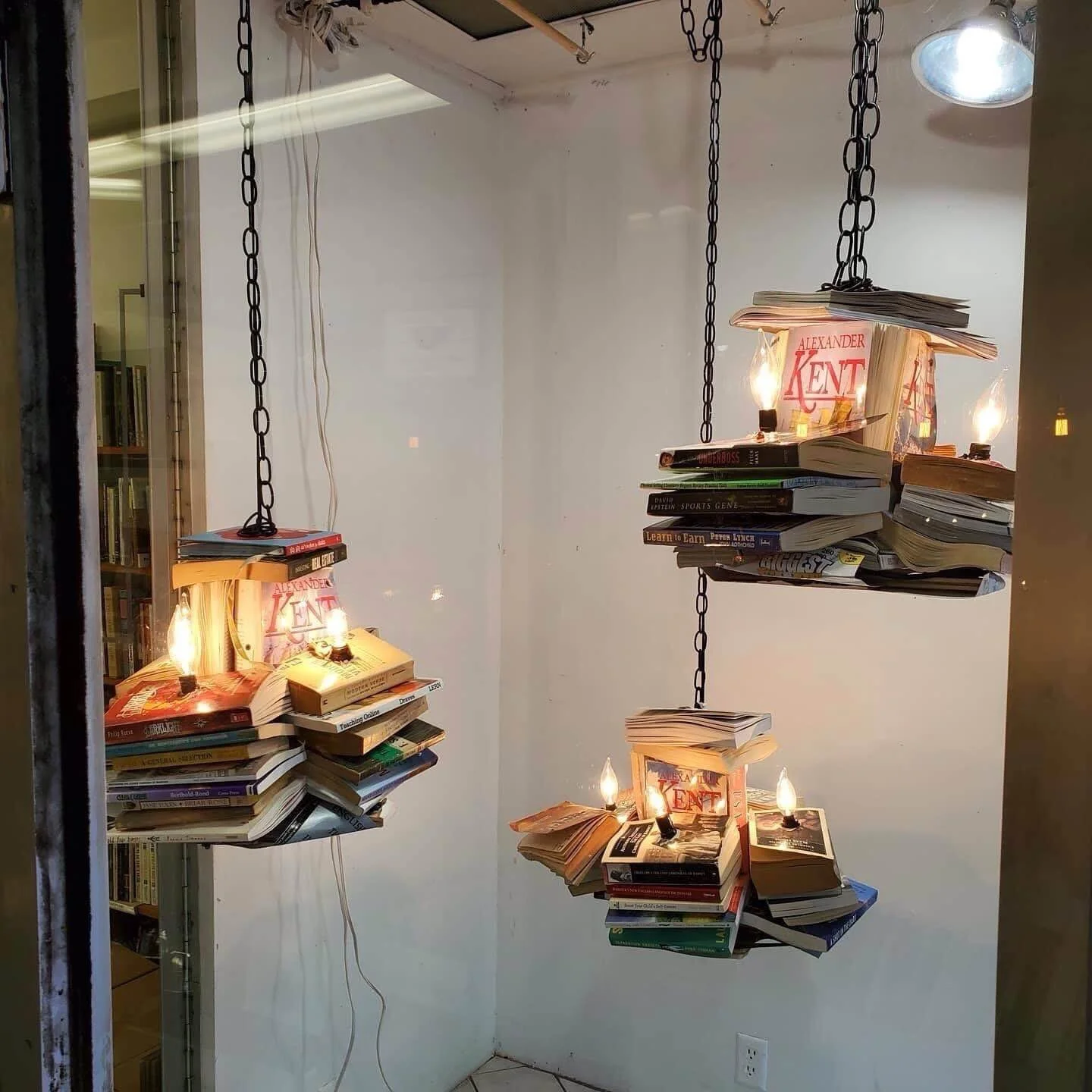
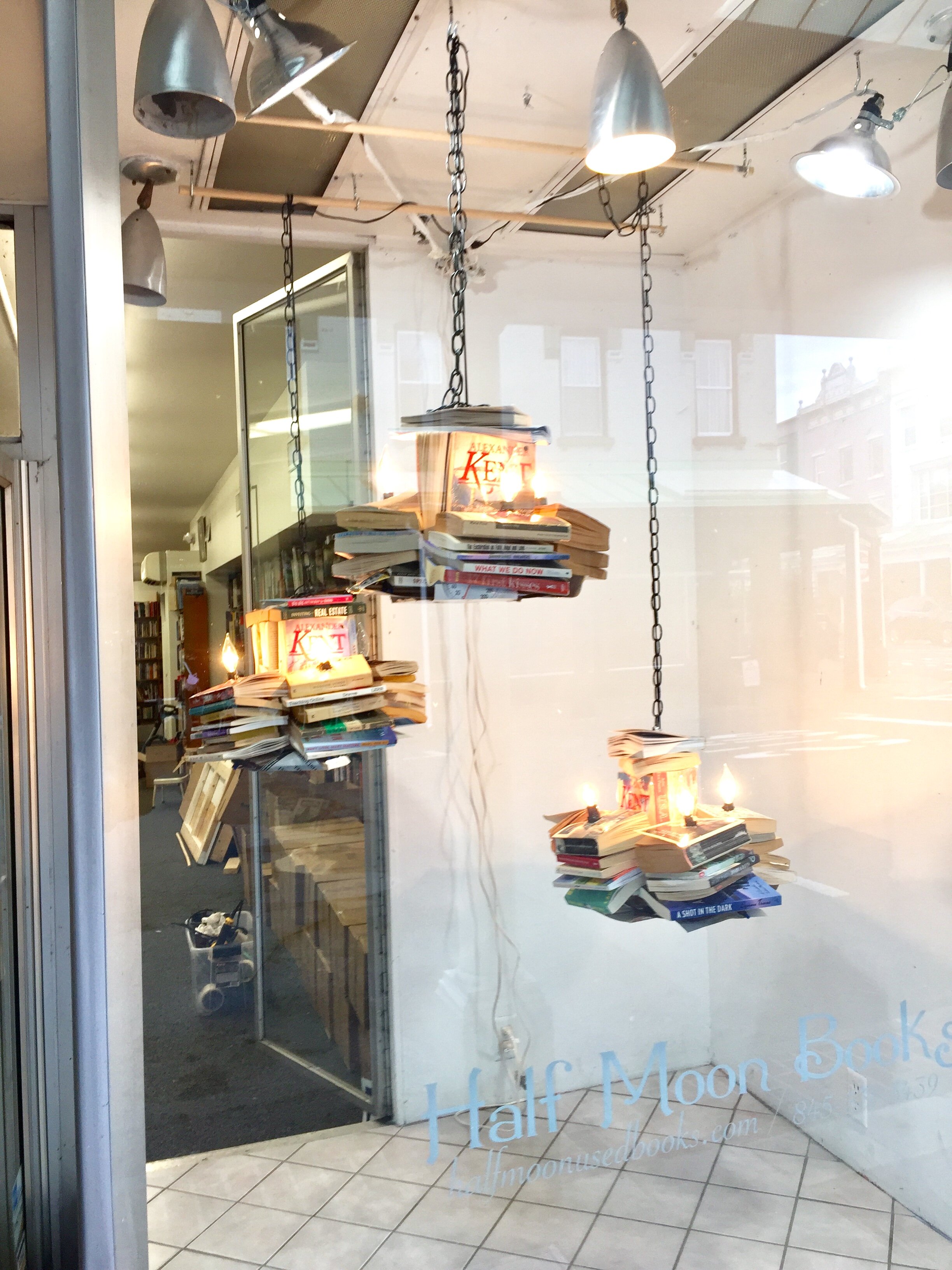
The new window installation for Half Moon Books is all lit up… This installation is a trio of chandeliers made of books. It was challenging, as it is with books, because of their weight, but I think it turned out fab.

Just a few drill holes and some basic elec wiring and voila… Book Chandeliers!

And a huge thank you John Cox for letting me take over his workshop.

IMG_1163.jpeg
All Apologies
Screen Shot 2020-08-26 at 9.24.27 AM.png

SORRY, I’M SORRY… no, really!

A recent phone argument with my dad which resulted in him yelling at me, hanging up and then a lame attempt at an apology leading me to learn how to make a true apology.

true apology does not include the word “but” (“I'm sorry, but …”). “But” automatically cancels out an apology, and nearly always introduces a criticism or excuse. A true apology keeps the focus on your actions - and not on the other person's response. I did not know this, but there’s four steps to a correct and sincere apology. Here goes…

  1. Acknowledge the offending behavior. Use “I” statements. I’m sorry I didn’t show up for our date. I’m sorry I didn’t pay you back. Etc.

  2. Show how the behavior was hurtful, and express remorse. Don’t say how the other person’s behavior contributed to the problem. This is less than sincere.

  3. Make amends. Tell the person what you’ll do to make things right. Even better, ask the other person what he or she would like from you.

  4. Promise that the offending behavior will not happen again.

If you want to read more (like tips on how to apologize) click here.

Many thanks to Anne Brandt for the research.

Garden Party
IMG_6339.jpeg

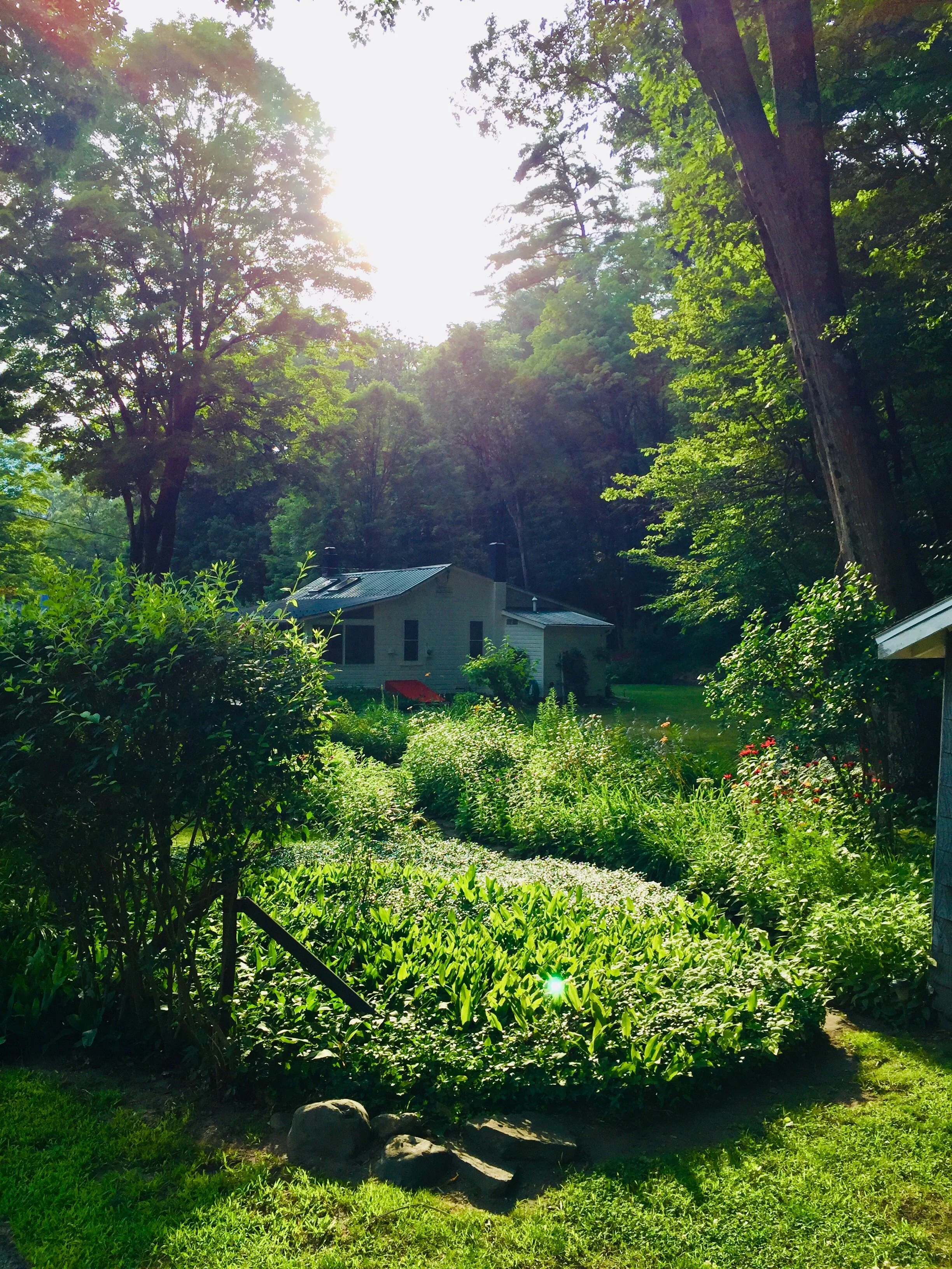
Among the other home improvement projects I’ve been working on during the pandemic, my garden is also on the list. I work hard on it every year, but this year, with the added free time, I’m very happy with the results. Rather than talk all about it, I thought I’d like the photos do all work ‘cause I’m tired. :-)

August Update - The Black Eyed Susan Festival

August Update - The Black Eyed Susan Festival


I've got the Magic RE-touch

I am so grateful that ever since the pandemic hit, that I’ve been busy with freelance work. Marketing, Social Media, Web development and Photo Retouching.

I’ve been retouching in Photoshop for over 15 years now and am 100% self-taught. Aside from watching YouTube tutorials, I’ve never once taken a single “official” class. I started back in my Fred Flare days knocking out backgrounds and whitening model’s teeth for the website.

Well, I’ve come a long way baby… I thought I would share some of my recent successes with you. Initally, I didn’t think I could do it, but with some persistence and perseverance, I made it work.

Check out the before and after wonders…

FIREPLACE: I lit up the wall sconce and added a fire in the fireplace.

KITCHEN: I removed the clutter in the background and the box at the door.

LIVING ROOM: Brightened it up, removed the finger in the upper right and also removed the door hinge.

If you need any photo retouching, please drop me a line. I’d be happy to give you a quote.

Mid-Century Mountain
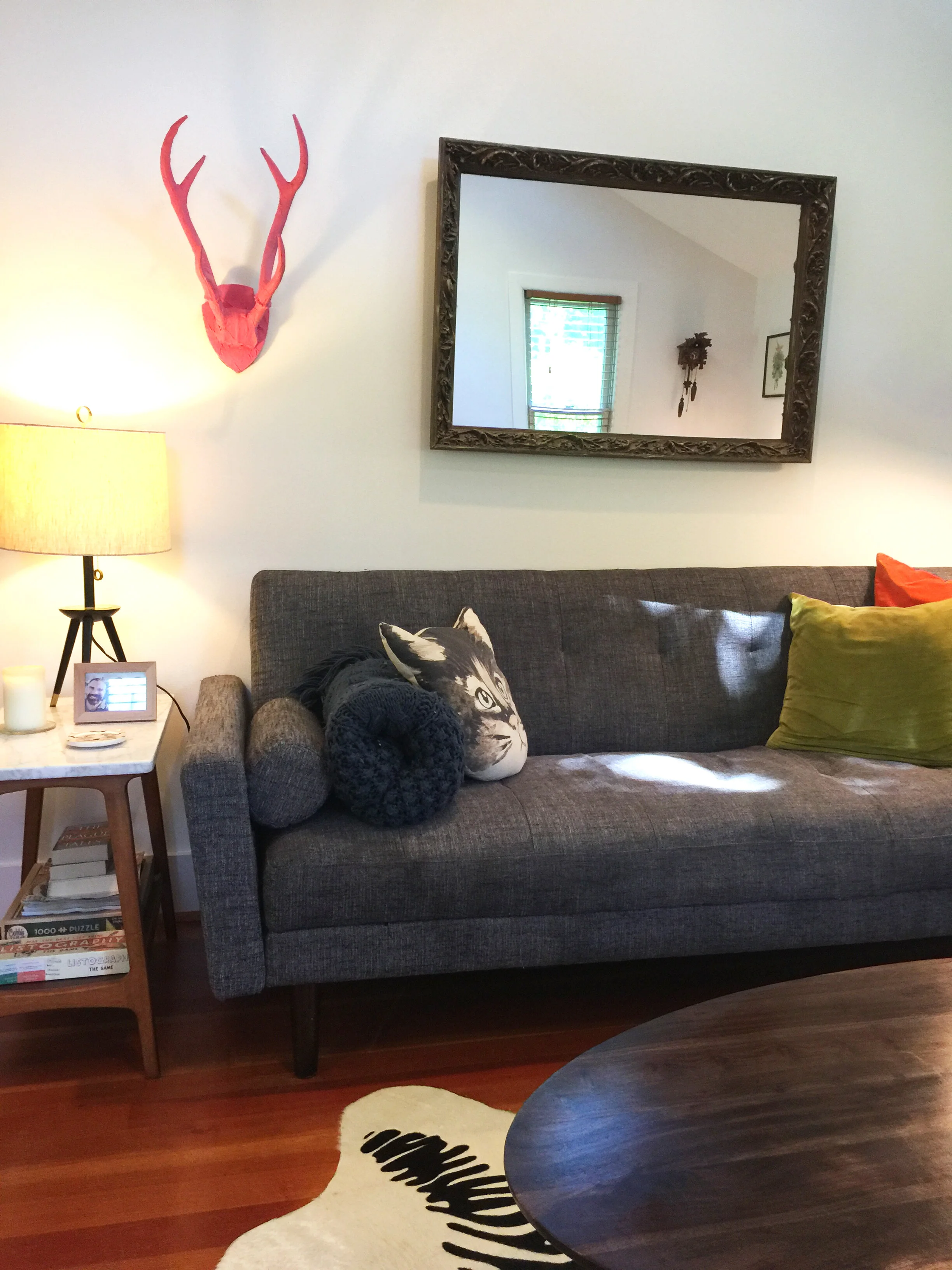
LIVING ROOM HORIZ.jpg

As my quarantine house painting project draws to a close, it’s time to pop back inside and check in on my Living Room. Because of the cathedral ceiling height, I had to leave this room to the professionals as well.

In keeping with my clean, modern Scandinavian look, I went with Benjamin Moore’s Decorator White on the walls and White Opulent for the trim. I really like the 2 contrasting whites. Why no color you may ask… Well, it was gray before and I wanted a brighter change.

I’ve coined my interior “Mid-Century Mountain,” I better copyright that. In addition to some great vintage items, I’ve collected pieces and furniture from some of my favorite brands with a retro spin…

Urban Outfitters, Design Within Reach, West Elm, CB2, Crate & Barrel, Jonathan Adler, Patch NYC, Annie Poon, Cardboard Safari, Muji, Crosely and IKEA… Quite the melange. But my fave is still the pink horns from Cody Foster.

Sweet Sue's
_website copy.jpg

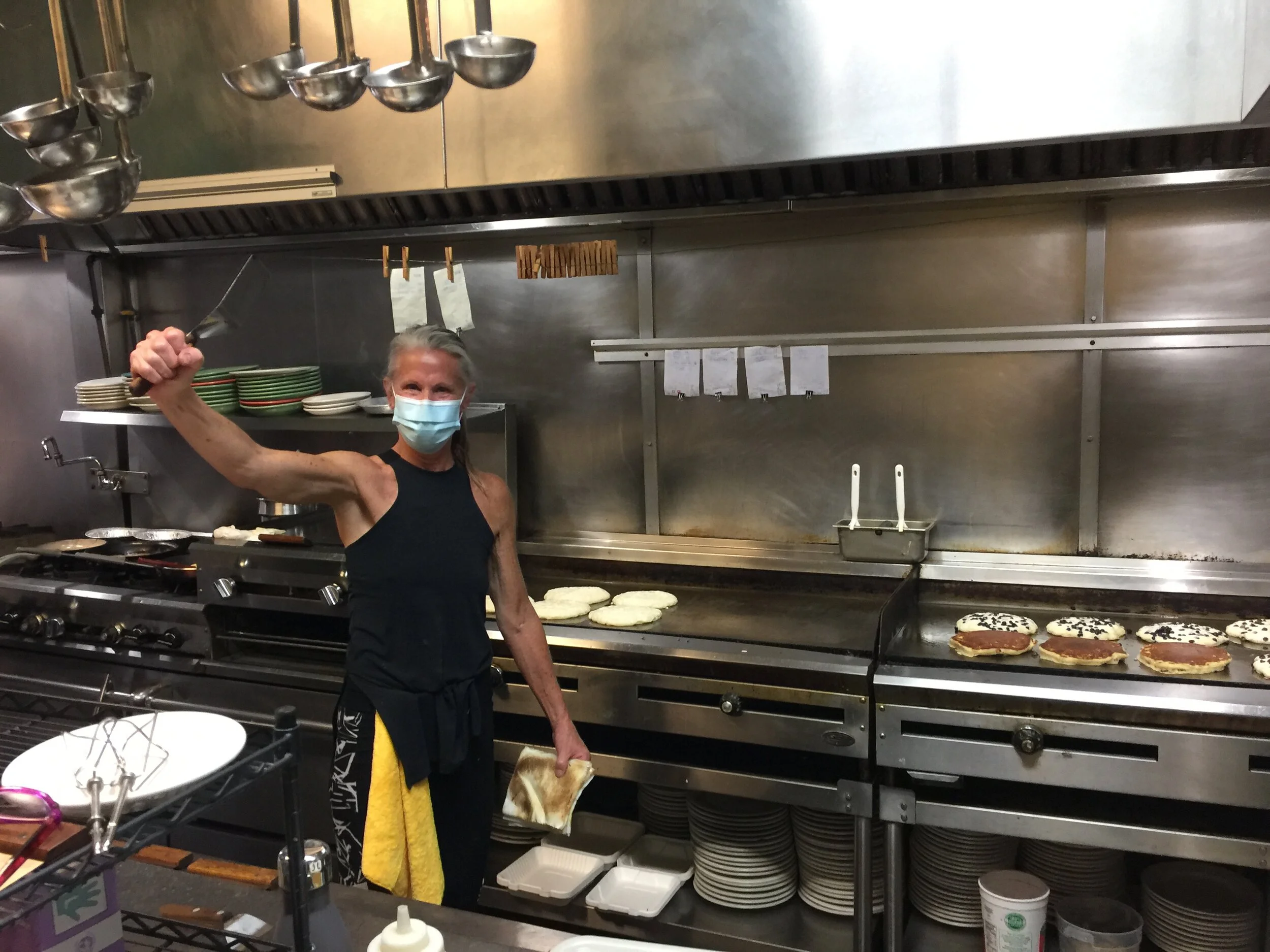
Dreams came true for me in an otherwise crazy time. I got to create Sweet Sue’s new website and their first ever “official” Facebook page? After being closed for the Covid-19 pandemic, Sue Taylor, the founder, decided to reopen for Take Out and wanted some help. I was thrilled that I got the gig.

Since started her business in 1984 and being famous for the most delicious pancakes that are as big as your head, Sue really didn’t ever have to market her business… It was all just word of mouth. But now we live in different times. Small businesses need a digital footprint to remain relevant and communicate with their fans/customers.

So, she wanted a simple, one page website that communicated the new Take Out policies in addition to her reduced menu. I used a GoDaddy platform site builder to keep her costs down. And the second I made her Facebook page, it was like the flood gates opened with eager fans ready to feast.

Who knows how this pandemic will playout, but I’m happy that my Pancake Dreams got to come true! Bon appetit.

Click here to view the project gallery.

The day Sweet Sue’s reopened… 6/27/20

White Dove
IMG_6130.jpeg

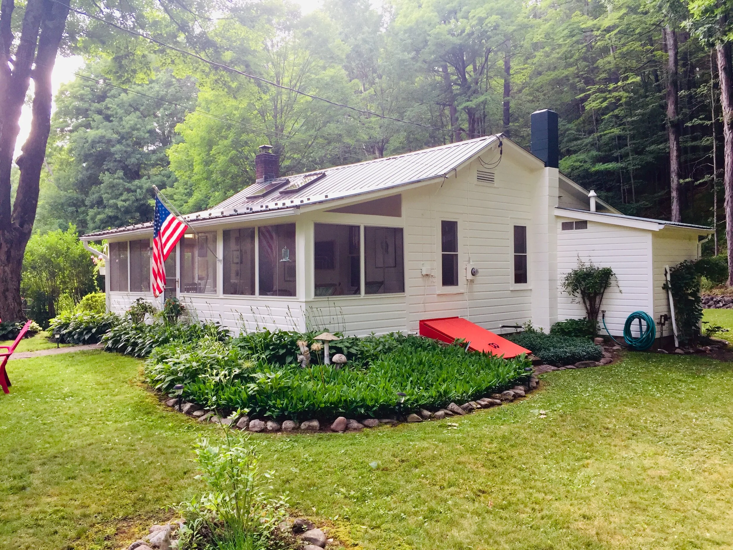
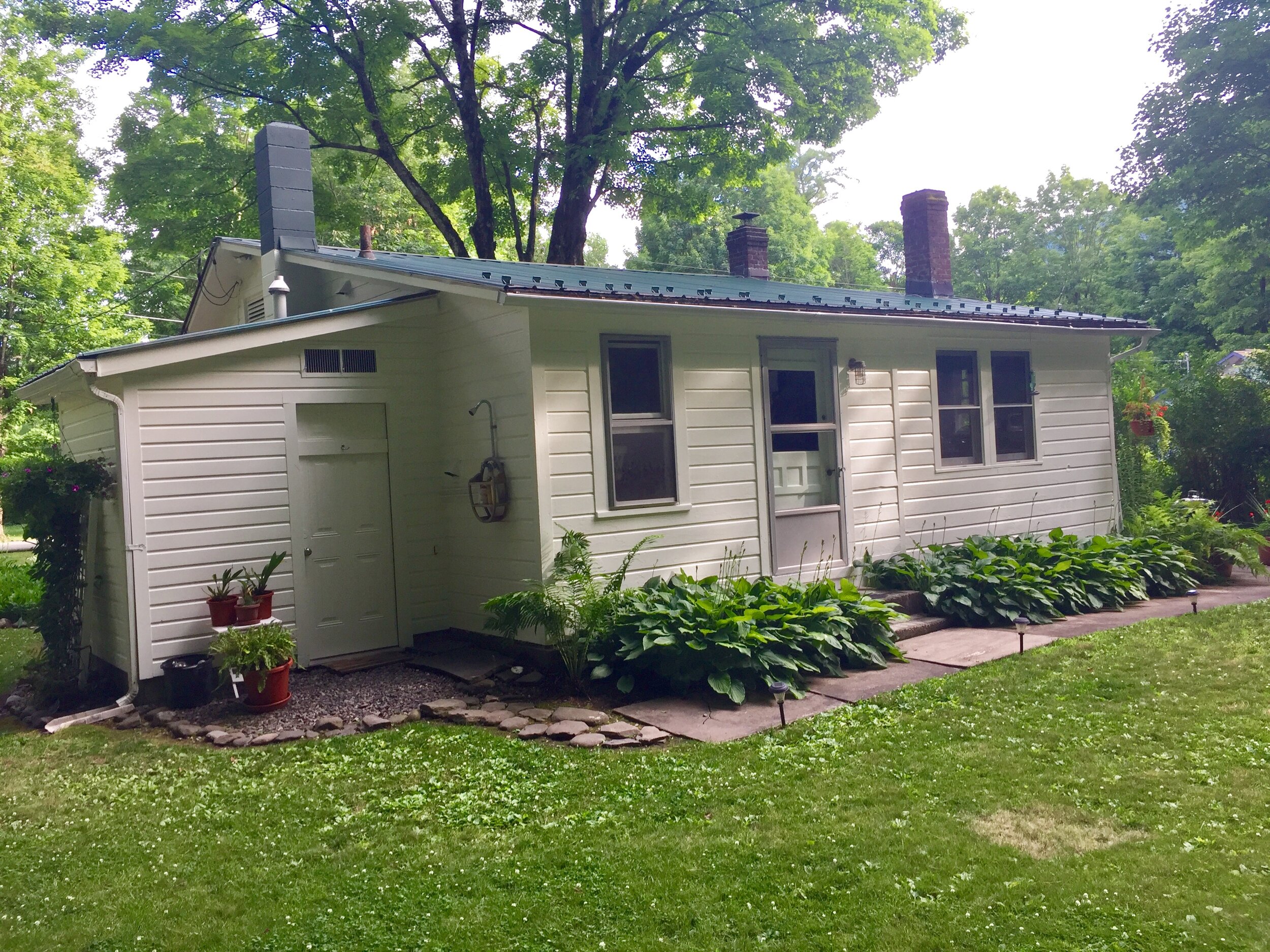
Let’s take a break from painting the inside of my Catskills cottage and check in on the outside…

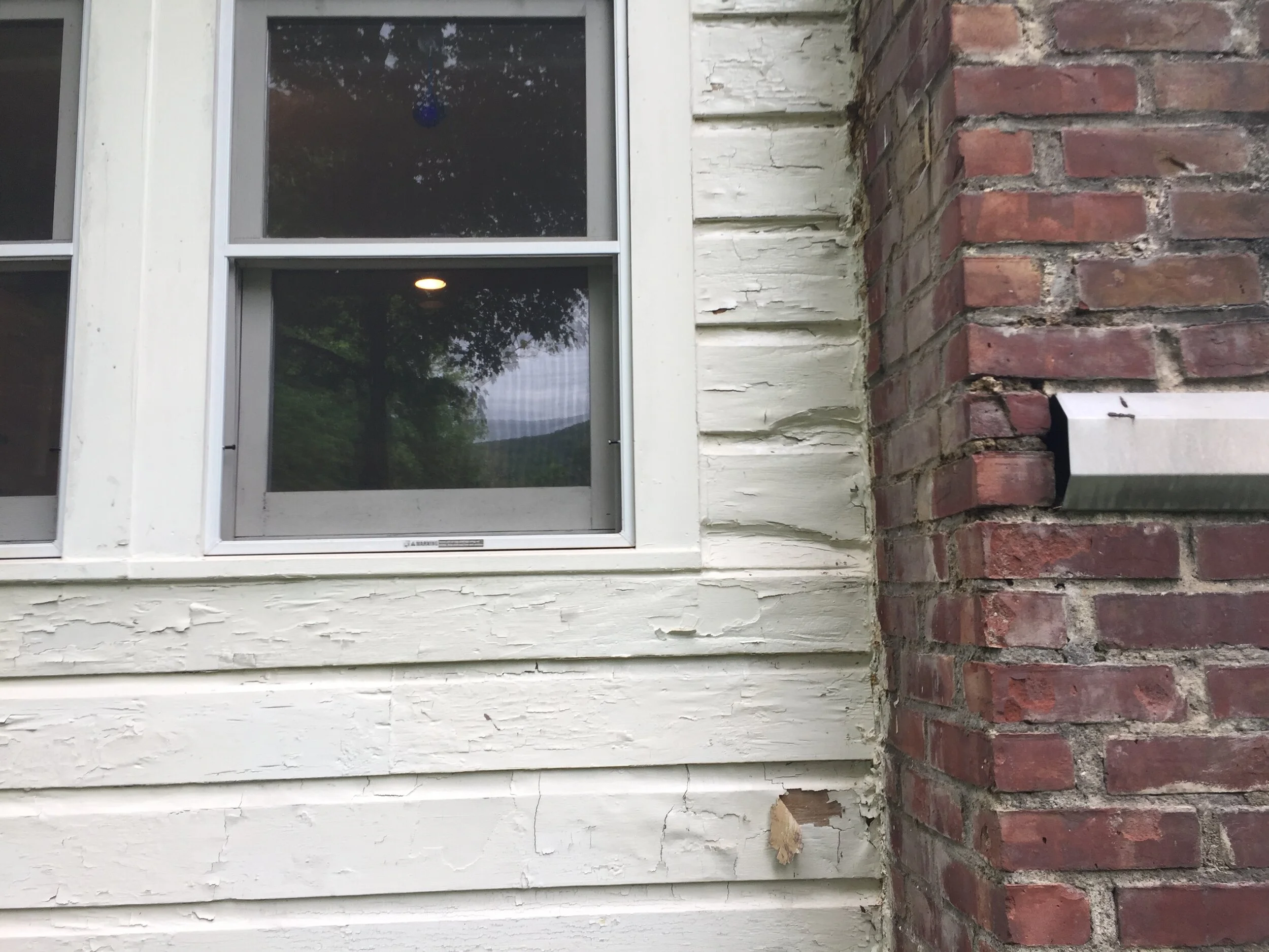
I get major vertigo if I go on just the 2nd rung of a ladder, so I had to leave this project to the professionals. I’d never painted my house in the 10 yrs of owning it and believe me when I say “it need it.” There were more chips on the house than in a Vegas casino. I also had water damage around the kitchen chimney which had infiltrated info the roof structure a bit - that was a fun surprise.

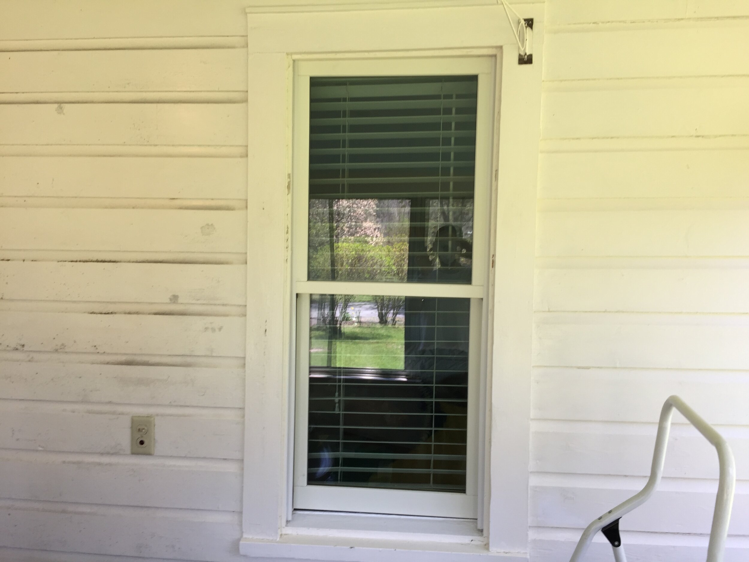
BEFORE - A paint chip extravaganza. The house was a “linen white” color which had a hint of yellow - but it was all basically flaking off and dirty, dirty, dirty!

POWER WASHING - The first thing the painters did was power wash the house. It was amazing. I know it looks crazy, but I was into it…

WATER DAMAGE - Then I had to hire a carpenter to repair the water damaged area at the kitchen window / chimney. He had to first rip out all the rotten wood siding and beams. Then replace it with pressure treated wood and re-flash around the chimney to prevent future damage. Check out the start to finish process.

AFTER - Last but not least, the finished product. I wanted the house to be a brighter white color but not “burn your retina” white, so I went with Benjamin Moore’s White Dove in an exterior luster finish. I think it turned out great. I love it, especially the Bilco Door painted in geranium red!

IMG_6095.jpg

Brian, the painter and me! He and his partner Skyler were GREAT!

Let's Grow Your Business
 
chris bick pioneer marketing.jpg

Hi, my name is Chris Bick and I wanna be your new marketing guy. My mission is to help small Hudson Valley businesses make and save lots of money! And in this post-Covid 19 landscape, this is an even more sacred task for me.

MY SKILLS: I can manage your social media accounts. I can launch or revitalize your website (utilizing GoDaddy, SquareSpace, Wix or Shopify e-commerce templates) and can design and implement your email marketing campaigns. I can help rethink and re-energize your business both online and on-site. I work hard and never give up. And with over 17 five-star reviews, you know you're getting great service with Pioneer.

Message me today for a free consult and we can review your business goals and budget!

 
I Don't Search I Find
pioneer marketing chris bick half moon books word search puzzle.jpg

My latest store window design installation for Kingston’s Half Moon Books is a Word Search Puzzle… There’s 5 words that are hidden in the puzzle of letters. Can you find them? See below for some spoilers.

When Jessica, the owner of Half Moon Books and I first met to discuss this window design, we wanted something fun and lite yet celebratory since this was to be her Post-Covid 19 Pandemic “reopening” Summer window. I honestly don’t recall how we landed on a giant word search puzzle, but when Jessica and I brainstorm, it’s like lightening in a bottle. Shablam!

And since it had to involve books, I thought if we opened books you could paint one letter per page. I went with a rainbow assortment of colors to make it fun, positive and happy… It’ Pride Month after all. Then I found this great website that generates Word Find Puzzles for you. The puzzle consists of 32 total books, 4 across (opened) by 8 down - essentially an 8x8 character puzzle. And voila… We had ourselves a window. I always feel like I’ll run out of window ideas but they keep coming. A reminder to believe in yourself.

The construction went so smoothly. I’m usually defying gravity, but compared to some of the other window installations, this one was pretty easy. And that’s exactly what I wanted.

Okay, can you find the following 5 words that Jessica picked: Justice (we gave you this one), Peace, Liberty, Equality and Love… There’s other ones but those are bonus!

Be safe out there. xo

SPOILER ALERTZ! Don’t go any further if you want to find the hidden words on your own.

 
ezgif-3-fbb5a69990fe.gif
pioneer marketing kingston ny window display half moon books.jpg
pioneer marketing chris bick half moon books word search puzzle i love you.jpeg
 
Porch Chops & Apple Sauce

The next chapter of my Coronavirus / Covid-19 pandemic quarantine home improvements project (wow, that’s a mouthful) was painting and redecorating my 3-season front porch.

This porch is one of my fave rooms in the house but it was beyond dirty. I think because it’s so wet in my area and the room isn’t totally air-tight that it gets really dirty and moldy. I was at the paint store and this guy said to just wash the walls with bleach and it would kill the mold. Aside from the stinky smell, he was correct. I barely had to wipe down the walls… The bleach just annihilated everything and left beautiful walls that barely looked like they needed painting. But I forged again… Besides, I wanted a slight color change.

Here’s the before. Not too bad, just a bit shabby.

Here’s the before. Not too bad, just a bit shabby.

One side bleached the other moldy.

One side bleached the other moldy.

Look at that beautiful fresh painted floor.

Look at that beautiful fresh painted floor.

PPE more for the bleach than covid-19

PPE more for the bleach than covid-19.

For the walls and trim I went with Benjamin Moore Exterior, White Dove (OC-18), Semi-Gloss. The floor is Benjamin Moore, Floor & Patio Latex, Light Gray and then there’s the ceiling, which I did in Benjamin Moore, Icy Blue (2057-70), Flat. And here’s why…

The existing ceiling was painted a light blue and I always wondered what that was all about. Was is supposed to evoke sky? Well, I did some research and here’s what I found: It’s called Haint Blue and it’s a tradition of painted porch ceilings blue in the South - originally created from crushed indigo plants.

From Wikipedia:

Originally, haint blue was thought by the Gullah people to ward haints, or ghosts, away from the home. The tactic was intended either to mimic the appearance of the sky, tricking the ghost into passing through, or to mimic the appearance of water, which ghosts traditionally could not cross. But while the enslaved Africans of the Low country and their descendants believed in the protective power of haint blue, the cultivation of indigo to produce the dye energized the 18th-century transatlantic trade, thereby increasing the enslavement of Africans.

As Gullah culture mingled with white southern culture, the custom became more widely practiced. The use of haint blue has lost some of its superstitious significance, but modern proponents also cite the color as a spider and wasp-deterrent. However, the color has not actually been scientifically shown to stave off bugs.

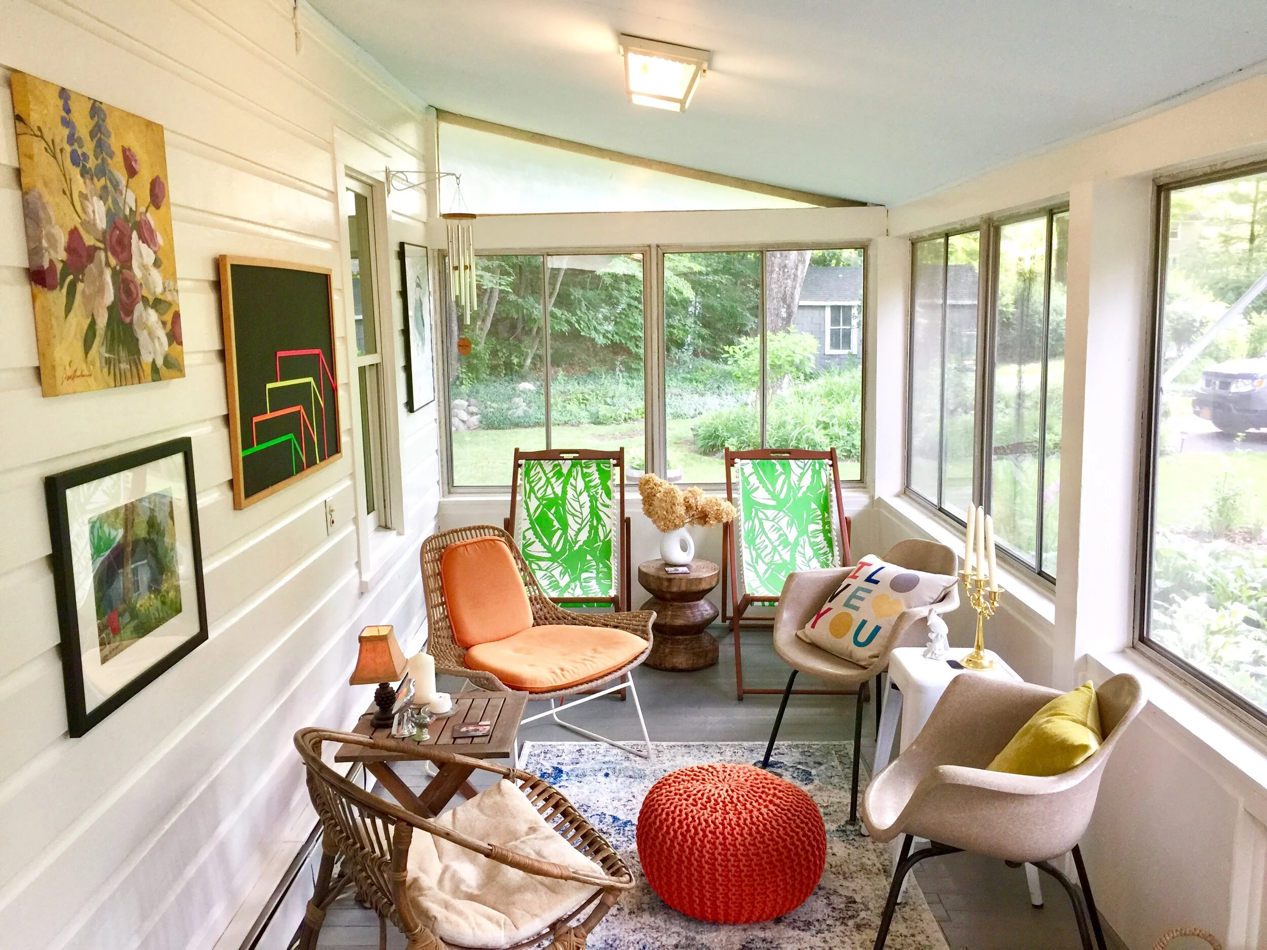
Once the painting was done, it was time to sass up the decor… I kept what I had but took out some of the wicker chairs to highlight the 2 vintage Eames chairs I have. They also compliment the orange Jonathan Adler chair. And then I brought out the 2 Lilly Pulitzer for Target lounge chairs. And doncha love that orange pouf from CB2?

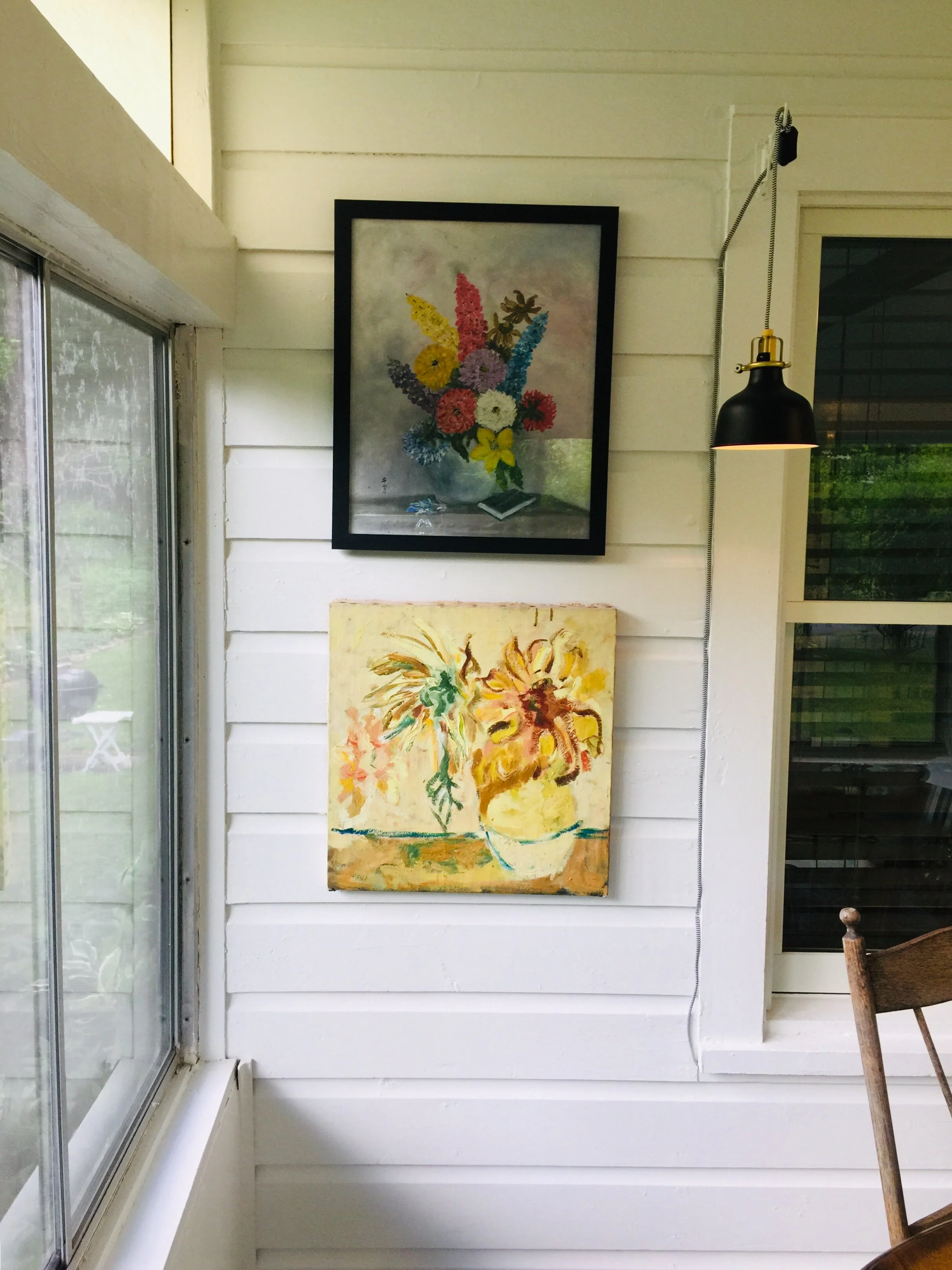
And in my little dining area, I put my Bea Åkerlund (Lady Gaga and Madonna's Stylist ) for IKEA crown bowl as my centerpiece surround by fun thrift store floral art.
And the after image… Can you feel the HAINT?

And the after image… Can you feel the HAINT?