Pioneer Forges New Territories

Hello from Pioneer! We’re a trailblazing agency that is more than just a marketing firm, it's a way of being. Let’s dive in!

First things first, what sets us apart from the competition? It's our passion for results-driven marketing. We know that a gorgeous website or a witty tagline isn't enough to make an impact. That's why we focus on measurable outcomes, such as increased website traffic, higher conversion rates and better customer engagement.

But what really makes us shine is our team. Chris Bick and Co. work tirelessly to craft custom marketing solutions that meet each client's unique needs and budget. From social media management to email marketing campaigns, we have the expertise to help your small business succeed.

Now, let’s talk about the fun stuff. Pioneer is based in NY’s beautiful Hudson Valley which means we’re surrounded by picturesque landscapes and some of the best hiking trails in the country. The beauty of nature inspires us to give you our freshest take on marketing solutions.  

So if you're looking for a marketing agency that's more than just a service provider, look no further than Pioneer in Kingston, NY. We’re passionate, results-driven and a whole lot of fun. 

Contact us today for a consultation.

A Very Catskills Christmas

Scenes from my little Catskills Cottage!
Happy Holidays from all of us at Pioneer… Which is just me. LOL

The Yarns We Spin

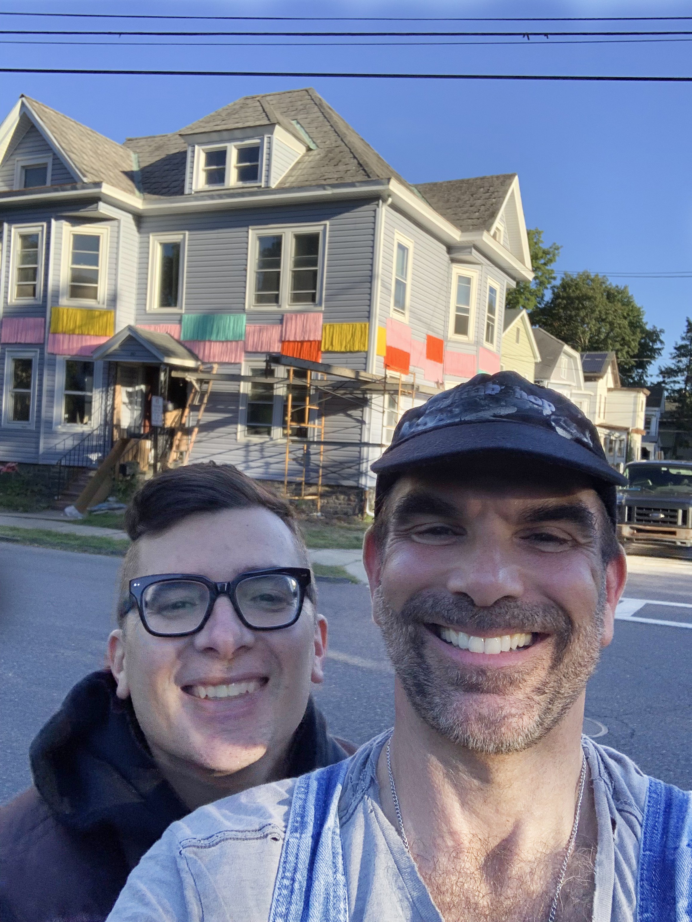
I was honored to be invited to create an exterior installation for the 5th Annual Kingston Design Connection’s Showhouse. The one catch was, I couldn’t attach anything to the vinyl siding that could cause damage. Once again I found myself having to defy gravity and make magic.

I thought this project would be a great opportunity to collaborate with my long-time design partner, Buddy Valentine, who’s recent work has been creating incredible yarn patchworks. I initially took inspiration from classic window details and treatments. Translating these shapes into yarn forms for the exterior of the house. Buddy I were then worried about the long yarn strands tangling so we ended up changing the concept to smaller sized checkerboard pattern in lively colors. The colors were derived from the Ukrainian Flag, the transgender flag and since it was for October - orange for Halloween.

The secret ingredient that keeps the panel intact are siding clips used for hanging Christmas lights. The best find of my life.

Enjoy the following galleries showing the transformation form our first ideas to the finished product…


Our initial inspriation photos…

Our first design direction - more like curtains on the outside and our color pallet…

After being fearful of tangles, we moved into this direction… A checkerboard pattern. And then went into production. We had 25 total panels to make.

Next, the installation with ladders and a wonky scaffold. Did I mention I’m scared of heights?

And the final product…

Photos by Phil Mansfield

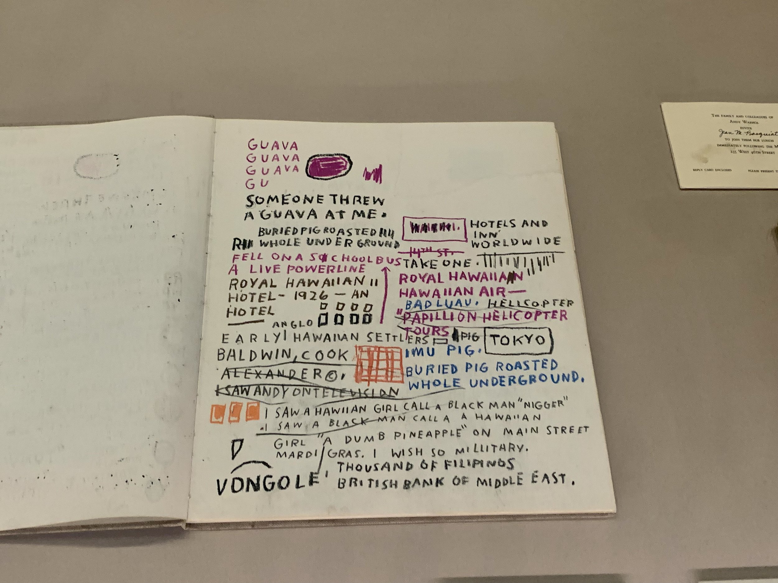
Jean-Michel Basquiat: King Pleasure

me, Susie, Heidi at the Basquiat show in NYC

I recently took a day off , headed to NYC to basked in Basquiat with Susie and Heidi, the super talented owners of Rock Scissor Paper. I really didn’t know too much about Jean-Michel Basquiat before seeing this show. I knew he briefly dated Madonna (pre-fame) and that was about it. It was incredible - He truly was AMAZING. They even recreated his Great Jones St. studio and the famous 80s club - The Palladium!!!

Go and see the Basquiat show NOW!

I even took a moment to visit Hudson Yards. The relatively new urban design mega-development on NYC’s west side.

Here’s some highlights…

The Sweetest Sue

My newest client is actually one of my oldest clients... Sweet Sue’s Phoenicia is back and has re-opened under new ownership with a New Orleans style culinary vibe... And I'm also back with the new Sue team doing marketing and web development.

I couldn't be happier that a much needed dose of adrenal has been injected into Main St. Follow them on FB and IG for the sweet scoops and a sugar coated website is coming soon.

Sweet Sue's Phoenicia is open Thu-Mon, 7:30a-3p. Come and taste the SUE'nsation!!! 🎉☕️🥐

Social Media Success

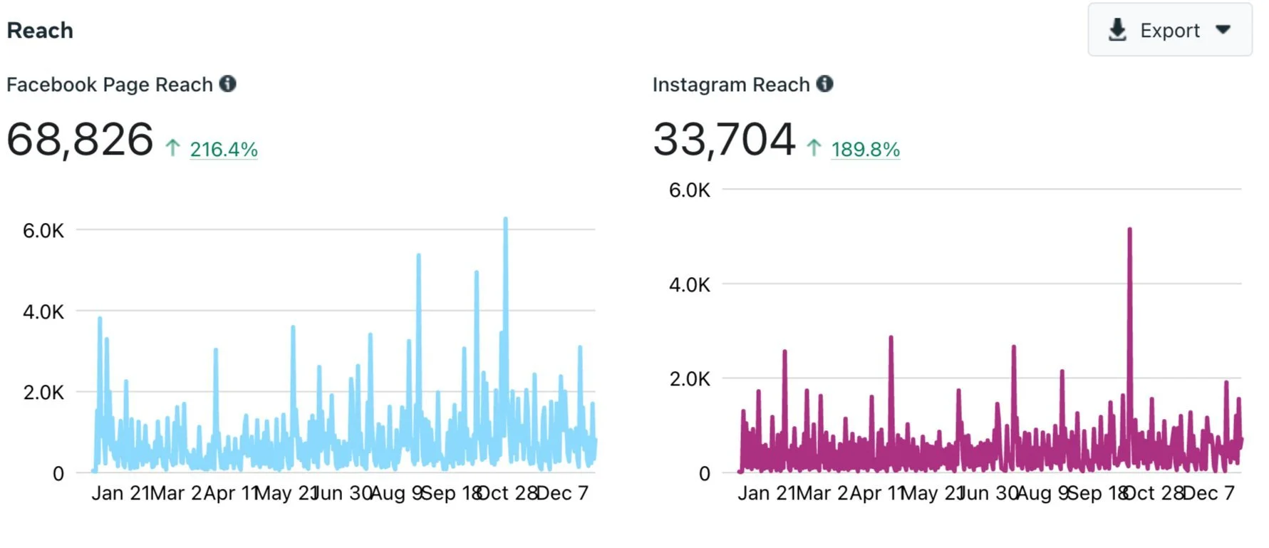
I am very proud to report some incredible numbers I’ve been able to achieve for The Phoenicia Business Association (PBA), whose social media account I manage.

As you can see from the image above, under my careful direction, their Facebook page’s reach is up over 200% and Instagram over %180 from the previous year (2021 vs 2020).

Here’s some key elements I did to achieve this growth…

  • I created a social media schedule and stuck to it

  • All “about” info was updated with frequently changed cover images

  • Featured hi-quality photos of the area (nature and built)

  • Highlighted the unique small businesses and their owners that make up the association

  • Followed the numbers - If something was working I kept it going

Click here to view more of my work for the PBA.

If you have a social media business account that needs help growing - Just give me a ring, I’d be happy to help out.

With Honors

While doing some Spring Cleaning in my file cabinet, I came across this old design competition I did to redesign the Cabrini Green Public Housing Project in Chicago - Sponsored by the Chicago Tribune, circa 1993. I didn't win but got an "honorable mention!"

You can read the little blurb but essentially the idea was to turn the site into shared-land farms with markets and the derelict buildings transformed to cultural/educational institutions.

Eek, that curved street dead-ending into the Chicago River is problematic but I love the patchwork colors and can totally see the Bernard Tschumi / Parc de la Villette influence. - C'mon folie.

#designcompetition #chicago #farm #patchwork #cabrinigreen #siteplan #publichousing #zoning #masterplan

Your Website & Social Media Digital Marketing Checklist
pioneer marketing.jpeg

Starting your website and social media platforms can seem like a Medusa’s head, but after years of helping to set up businesses online, I’ve compiled this handy-dandy  checklist for launching an amazing digital footprint for your business.

Feel free to email me if you have questions or need help.

First of all, I’m guessing that you have a business name, purpose and logistics figured out. That you’ve purchased your URL address via GoDaddy or Hover and that your branding and logo are all in place. And don’t forget your mission statement, business plan and goals - All key components necessary when starting a business in today’s digital age.

Whether you’re building a Wordpress, Wix, SquareSpace, GoDaddy, Shopify or some other platform-based website, here’s what you need to do:

  • Favicon: It’s the small square graphic that brands your business in browser windows and bookmark pages. They’re usually no bigger than 100pxl x 100 pxl.

Favicon Graphic
  • Browser title and Site Description: Think of these as offshoots of your mission statement. They help Search Engines properly display your business in appropriate searches.

Browser Title

Browser Title

Screen Shot 2020-09-15 at 2.35.37 PM.png

Site Description

  • Add descriptions to all of your pages. I usually take the site description, full of rich keywords for my business and copy them into the metadata of each page of my site. This will also help SEO (search engine optimization). 

  • Photo Titles: Make sure you title all of your site’s photos to include your company name and any other important keyword info.

  • Site Security and SSL Settings: Very Important! Confirm your SSL security settings are in place to prevent hackers from impersonating you or stealing visitors' information.

  • Facebook and Instagram: The main 1-2 punch social media platforms. There’s so many more but these are the go tos. Be sure you’ve set up correctly, your business FB and IG accounts with your about and bio sections fill out correctly. For Facebook I like to rearrange the tabs so they're in an appropriate order for my business. I will also add a “join email” tab linking to my Email Marketing account so customers can sign up and an Instagram tab via Woobox so my customers can easily follow my IG account.

  • Social Media Icon: Be sure to connect your social media accounts to your website and the social media icon links to your footer and your contact page. I don’t add them to the header too much, especially for e-commerce websites because they take the customer off the site straight away.

  • Contact Page: Have a clear and easily accessible contact page with your address, phone and email address. As I mentioned before, I also will repeat the social links.

  • Copy, Copy and more Copy AKA Text: Add text to your site pages. Descriptions, titles and photo captions. Have a well laid out About page. Include your mission statement, history and bio, with photos of you, your business and team. People love seeing the people behind their fave brands!

  • Email Marketing: Connect your site to your email marketing platform and add a signup field, usually in the footer.

 
Screen Shot 2020-09-15 at 2.53.16 PM.png
 
  • Blog: Add a blog if you’re up for it. Search engines respond to a site that’s active and changing and a blog is a great way to keep adding new content. Even if you just repeat your social media posts on your blog, it’s great to have the additional/expanded content for your site.

  • Google Analytics: Set your your Analytics or Google Analytics pages so you can properly follow your traffic and adjust your business accordingly.

  • Google Console: The last 2 points are part of the Google Webmaster system. Setting up a Google Console account will allow you to submit your site map to Google so all of your pages and photos are properly scanned by Google for searches. It’s FREE.

  • Google Business: This is a great feature that allows you to verify your business address so you show up in the Google location searches as well as allows you to manage your customer reviews and also build a website. Also FREE!

Hope this helps. Feel free to email me or leave a comment with questions.

I "Hearth" You

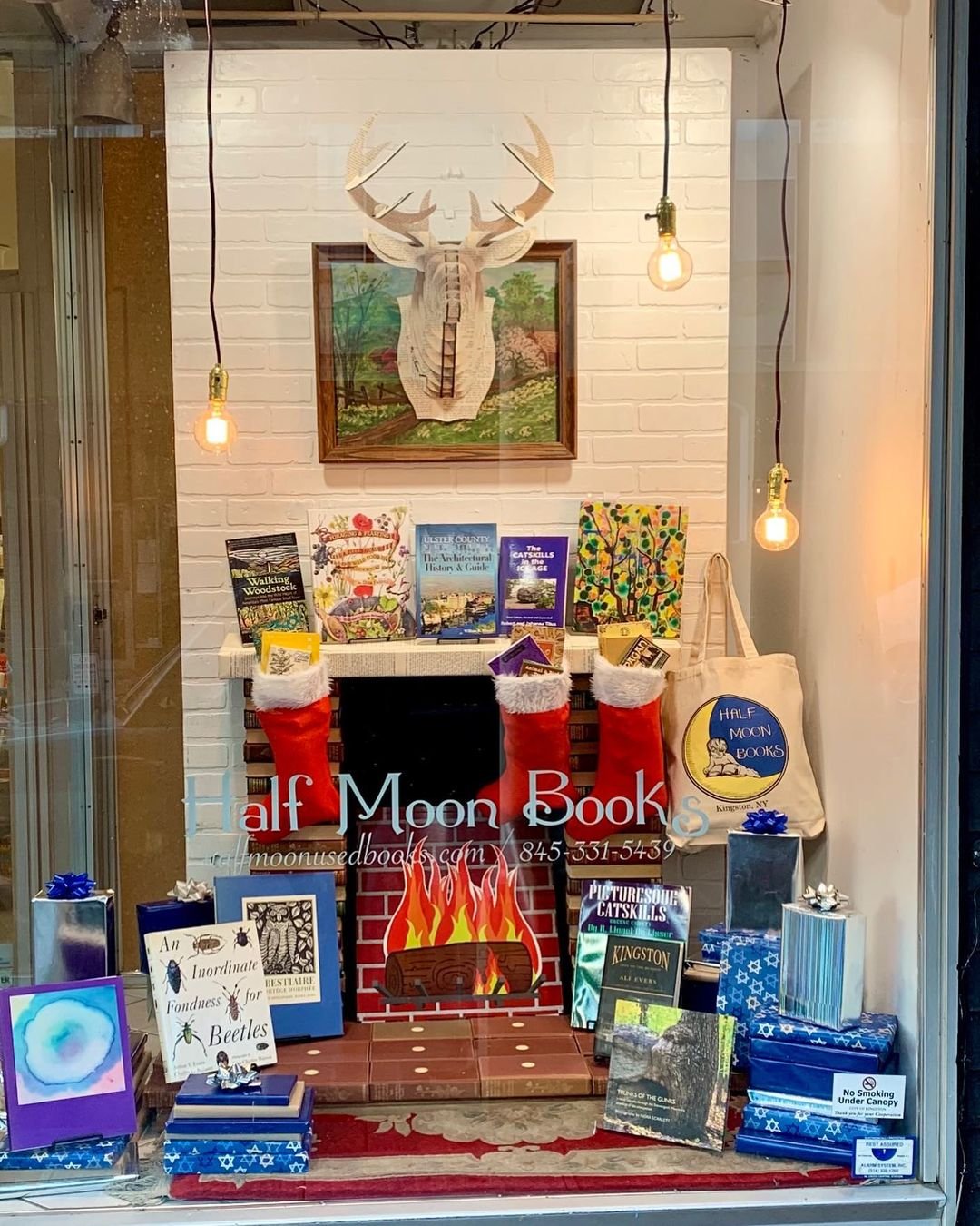
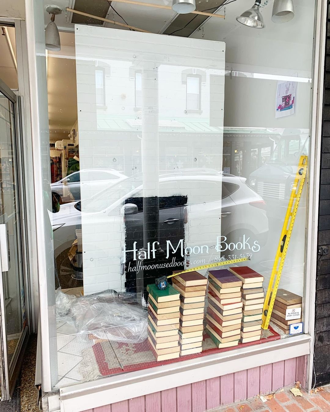
Check out my latest and greatest Holiday store window display for Half Moon Books: a fireplace made of books.

I started with a composite “inspirational” image that I made in Photoshop and went from there. The fireplace frame and hearth are all made of books. The mantle and deer head are cardboard covered in pages from The Ugly Duckling story. And then I just packed out the display with books, books and more books! I went opposite of my usual minimalism for this edition.

Happy Holidays.

Legoland

Real life or Lego? As an 80s babies, my design passion was first ignited by a simple set of Legos that I would create into special worlds of my own (see last image) but this takes it to a whole new level.

The "comfort town" housing project by archimatika is a colorful development of concrete buildings in Kyiv, Ukraine, responding to the surrounding 50s and 60s communist-era housings

#architecture #colorful #lego #inspiration #designboom

That's a Tall Order
doric trabeation Chris bick .jpg

"Doric Trabeation" - Watercolor on Arches Paper. I made this painting of the classic Doric Order of architecture in my first year of Architecture School (Univ of IL at Chicago, 1987). Crazy how time flies. I was really shocked to learn that the Greek Temples were really painted in these bright colors.

#architectureschool #watercolor #doric #trabeation #painting #greektemple #ancientGreece #Doricorder #Parthenon #Triglyphs #metopes #guttae #mutules #axonometric #entablature #Bucranium

LA PoMo 84
kcet.brightspotcdn.jpg

A huge shout out to my fave design stars Susie and Heidi Bauer of Rock Scissor Paper who recently turned me onto the gloriously Post-Modern (PoMo) design of the 1984 LA Olympics by the very colorful Deborah Sussman. I'm obsessed - I wanna go back to the 80s. I mean 1984 with Marylou Retton? C'mon Mar... And guess who else came on my radar in 84? Yup, Madonna!!!

Paper Dress
pioneer half moon books kingston ny paper dress.jpeg

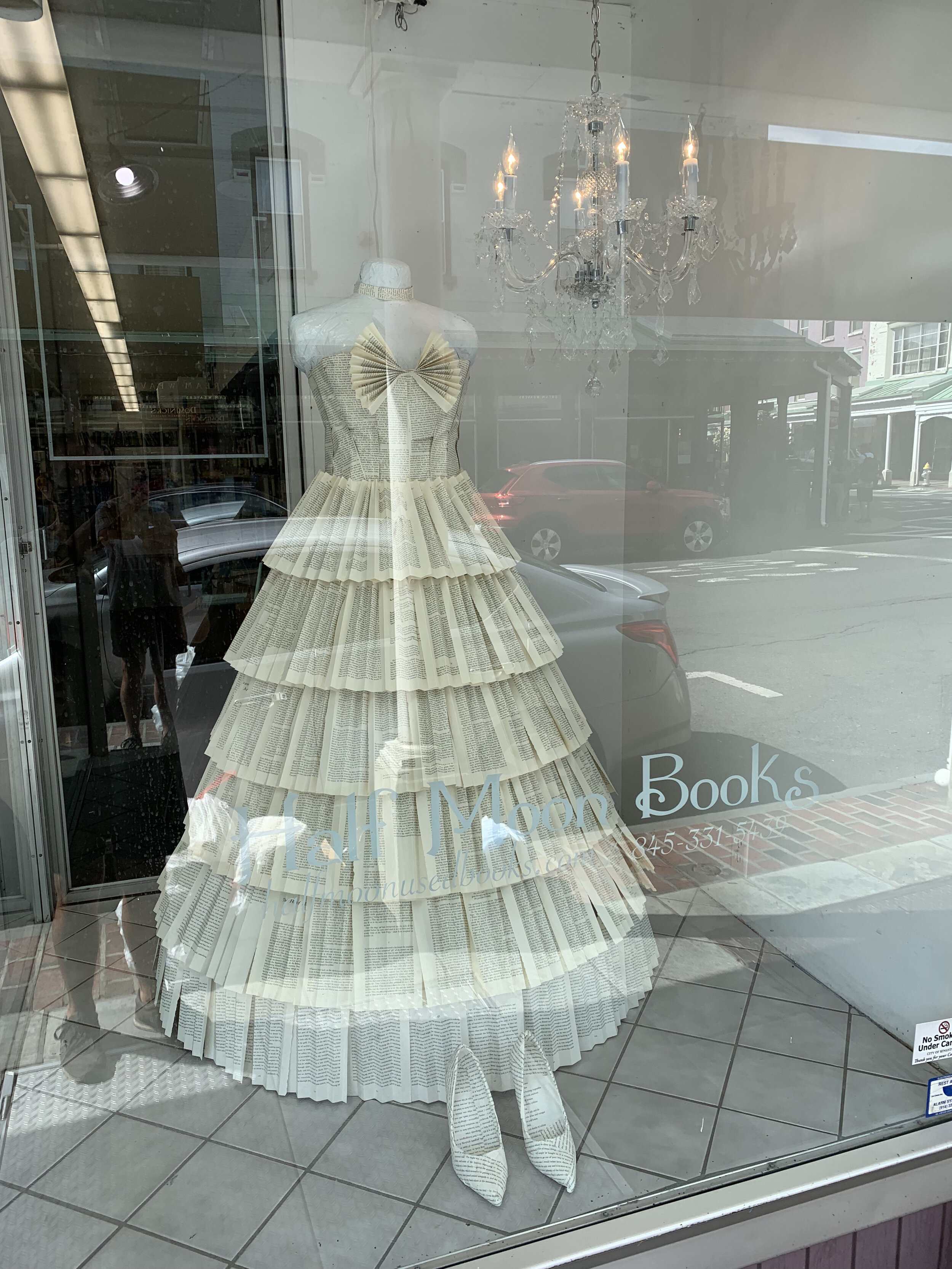
Introducing my newest window display installation for Half Moon Books in Kingston, NY. The title is “Let Them Read Books.” Very Marie Antoinette meets Vogue.

With the coming Fall / Back to School season upon us, I wanted to do something that I hadn’t ever done before. Whenever I finish a window I feel like I’ll never have another ideas and then here we are - a paper dress extravaganza. I actually got the idea from an episode of RuPaul’s Drag Race where the queens had to make garments out of one of Ru’s books. I thought yes, I have to do this, but a fashion piece is really out of my “architectural” comfort zone. But if you’re not challenging yourself, you’re not growing, correct?

So, I found these images as my inspiration. I fell in love with the paper pleating: I told myself, “I can do this!”

To make the paper gown I bought some fabric costume pieces to attach the paper too. Gotta love hot glue guns and spray mount - They’re magical. And of course I had to do a pair of pumps.

But then I had a huge predicament. I had build the dress offsite in one piece - how was I going to get it to the bookstore without damaging the design - walk her across town of course. I am a “put on a show” kinda girl after all. So, off we went.

Here’s some shots of the final installation. I added a chandelier for the full fancy vibe. I hope you love it as much as I do. Check out more of my displays at Half Moon Books here.

spa'stic

While I was visiting my bonus mom Anne in MI last week she took me to Andrews University (a private Seventh-day Adventist university in Berrien Springs, MI) and treated me to a day at their brand-new fitness/wellness center - The Andreasen Center for Wellness designed by Design Collaborative. I was obsessed with the cool lobby furniture, the salt water pool and their "healing center" - I mean, the steam room has a sparkling ceiling.

Blowing Kisses in the Wind
IMG_9025.jpeg

Sealed with a KISS... Inspired by Chicago's Magikist sign of lore, this collaboration with Buddy Valentine is a sweet kiss to Kingston NY (our new/old home now). Hey locals, can you find all the lips around town? Scavenger hunt alerts!!!!

Here’s the full SWAK Bike Rack collection:

#magikist #lips #magritte #surrealisam #bikerack #opositive #wallmural #painting #kiss #swak #mwah #art #installation #collaboration #inspiration

Sweet Home Chicago
Whatever it is, the way you tell your story online can make all the difference.

Whatever it is, the way you tell your story online can make all the difference.

During my recent visit to Chicago I was stuck with all the vintage signs still there and missing the ones that are gone forever. I really miss the MagiKist the most - You can see how it inspired a “recent” project in Kingston.

#chicago #signs #vintagesigns #design #midcentury #roadsideamericana #neon

 
Max B
173999546_4164281180298121_677109547580449877_n.jpg

Speaking of Fred Flare, we also launched a more sophisticated brother brand (for 5 mins)... MaxB (Modern and eXciting Building) connecting with my architectural background. Here was my masterpiece: A plexi DIY dollhouse - think Barbie's Dream House meets Wonder Woman's jet meets a Mid-century Modern glass house. It was $300 and someone actually bought it. I hope some little boy is still loving it today.

And also my foray into lighting design… The ever adorable Starlight Lamp. I should make a few more of these and try and sell them online.

#lamp #lighting #design #interiordesign #productdevelopment #fredflare #dollhouse #diy #plexi #plastic #iplaywithdolls #barbie #barbiesdreamhouse #dolls #midcenturymodern #canalplastics

Let's Stay in (re)Touch
Screen Shot 2021-04-13 at 11.50.46 AM.png

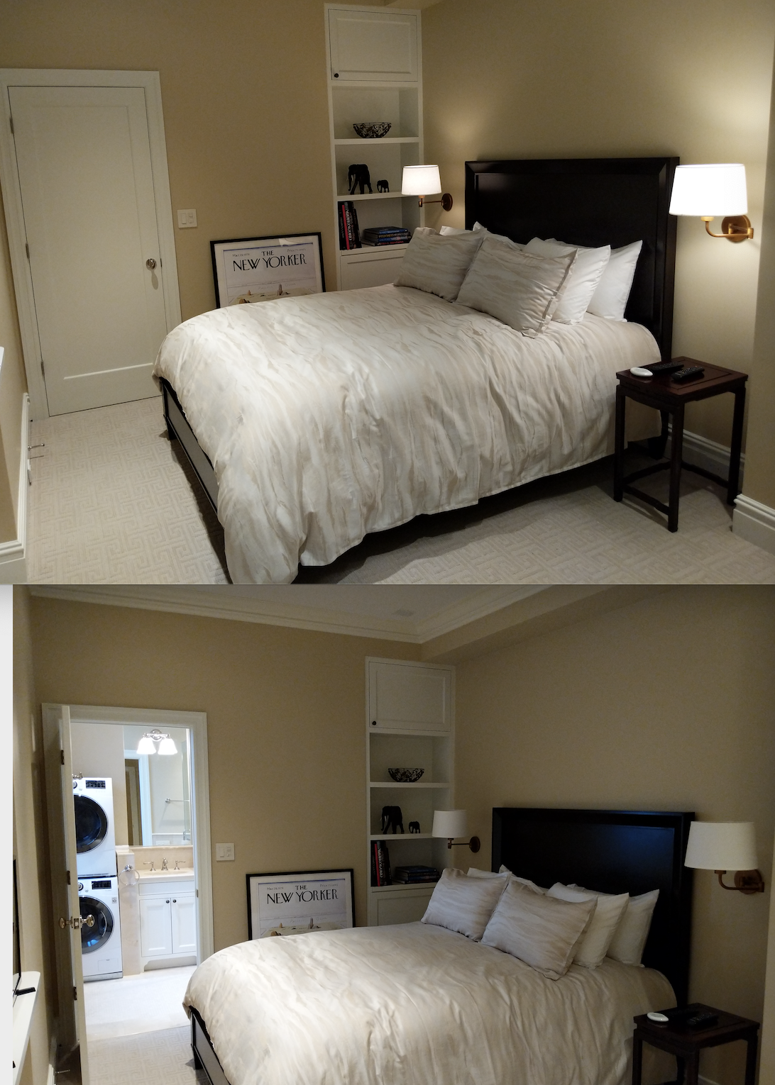
Some retouching magic to share... I know you love a photoshopped before and after comparisons. Can you tell what I did to transform the photo?

The bedroom scene is my fave… it’s a composite of 3 photos combined into one masterpiece. #backpat

  • Bedroom Light on door closed

  • Bedroom Light off door open

  • New Yorker wall art

#photoshop #retouching #photography #marketing #beforeandafter #architecture #interiordesign #NYC #newyorkcity